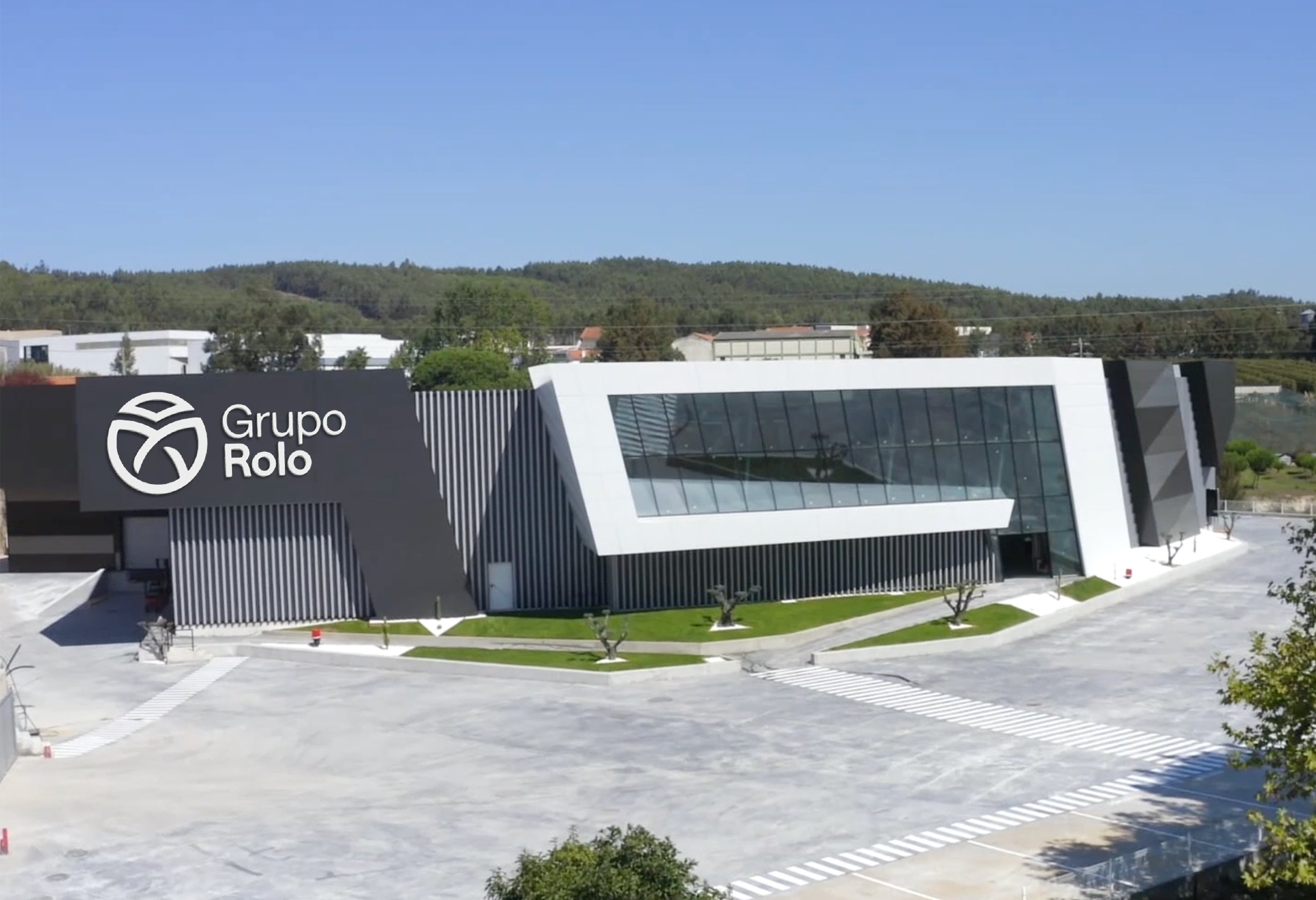
Grupo Rolo
Family Business, Globally Capable
Founded as a family business, Grupo Rolo has evolved into a company with international reach and capabilities.
How do you communicate global high standards without losing the familiar core?
That was our challenge.
Categories
BrandingPackaging Design
Environments
Communication
Web Design
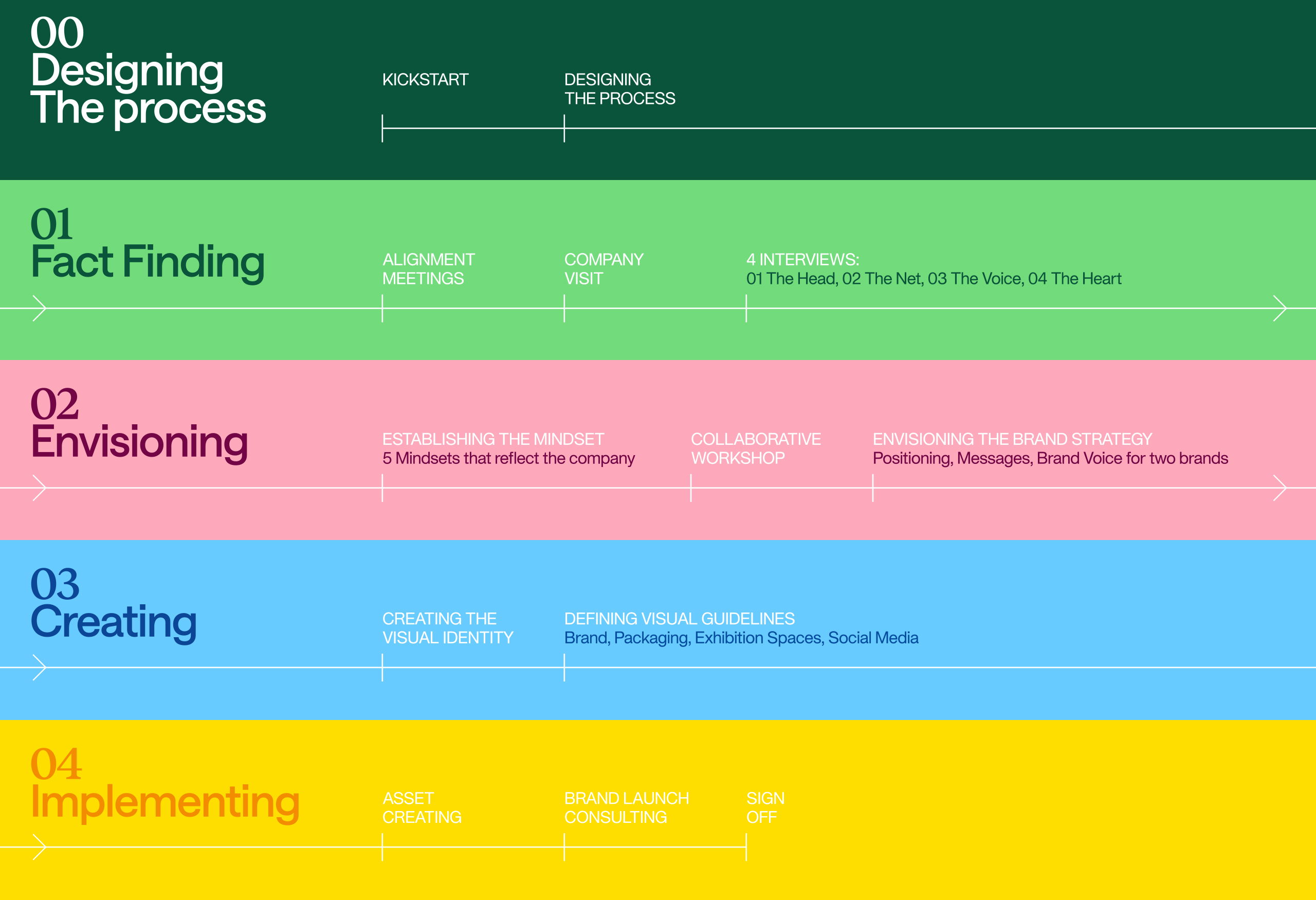
To answer this question honestly, we designed a collaborative process together with their marketing team, aimed at uncovering their reality, culture, and strengths.
We began with four interviews, each with a specific purpose:
The Group’s CEO — The Head
The Market Managers — The Net
The Marketing and Design Team — The Voice
A group of long-serving employees — The Heart
From their words and stories, we gained a clear understanding that Grupo Rolo already had a strong identity — a family-driven approach combined with international standards and capabilities — resonating from the inside out.
They simply didn’t have a brand to express it.
So we distilled the identity that emerged from their insights into five mindsets, designed to guide the entire process — a set of pillars upon which the brand and communication had to be built.
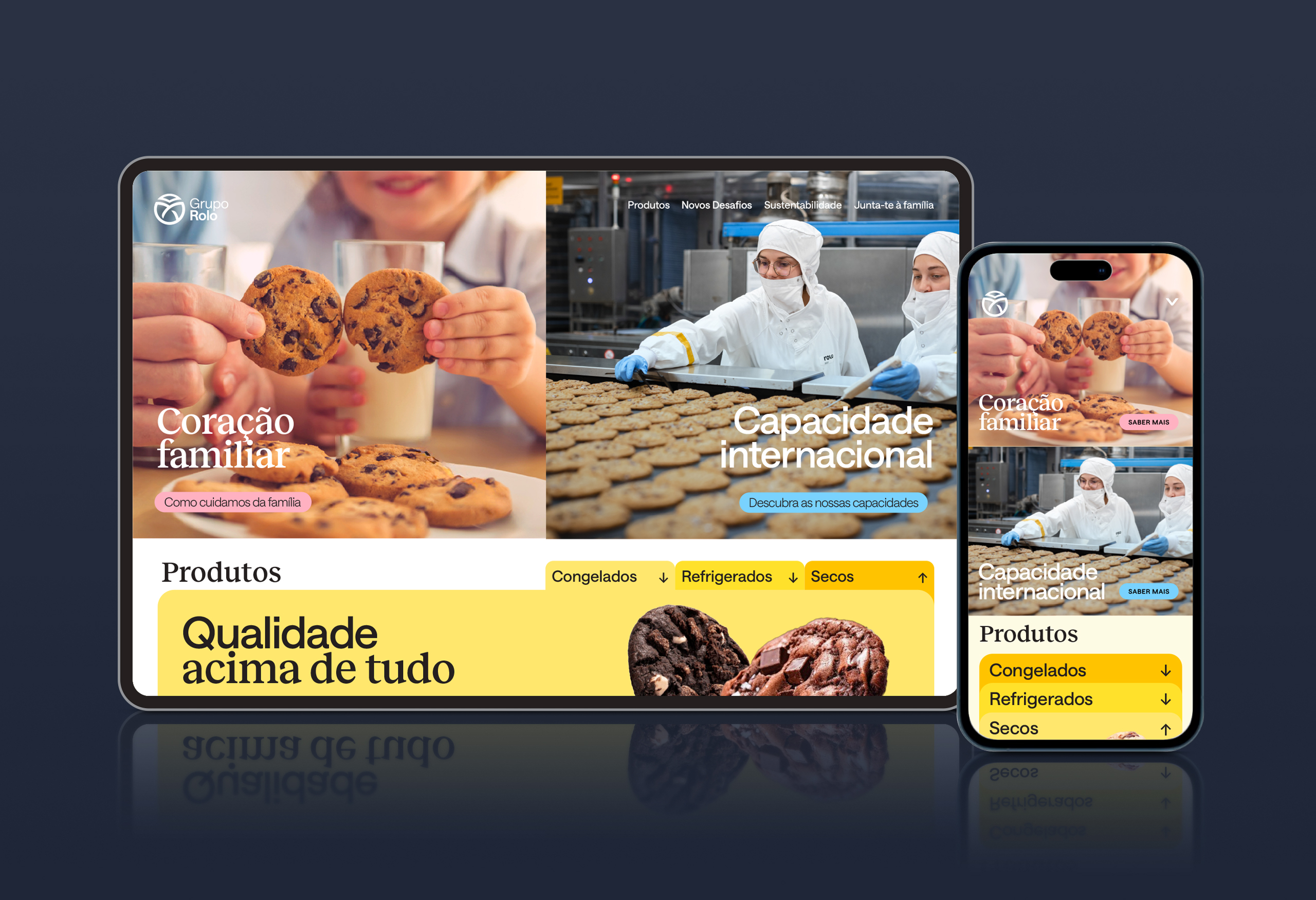
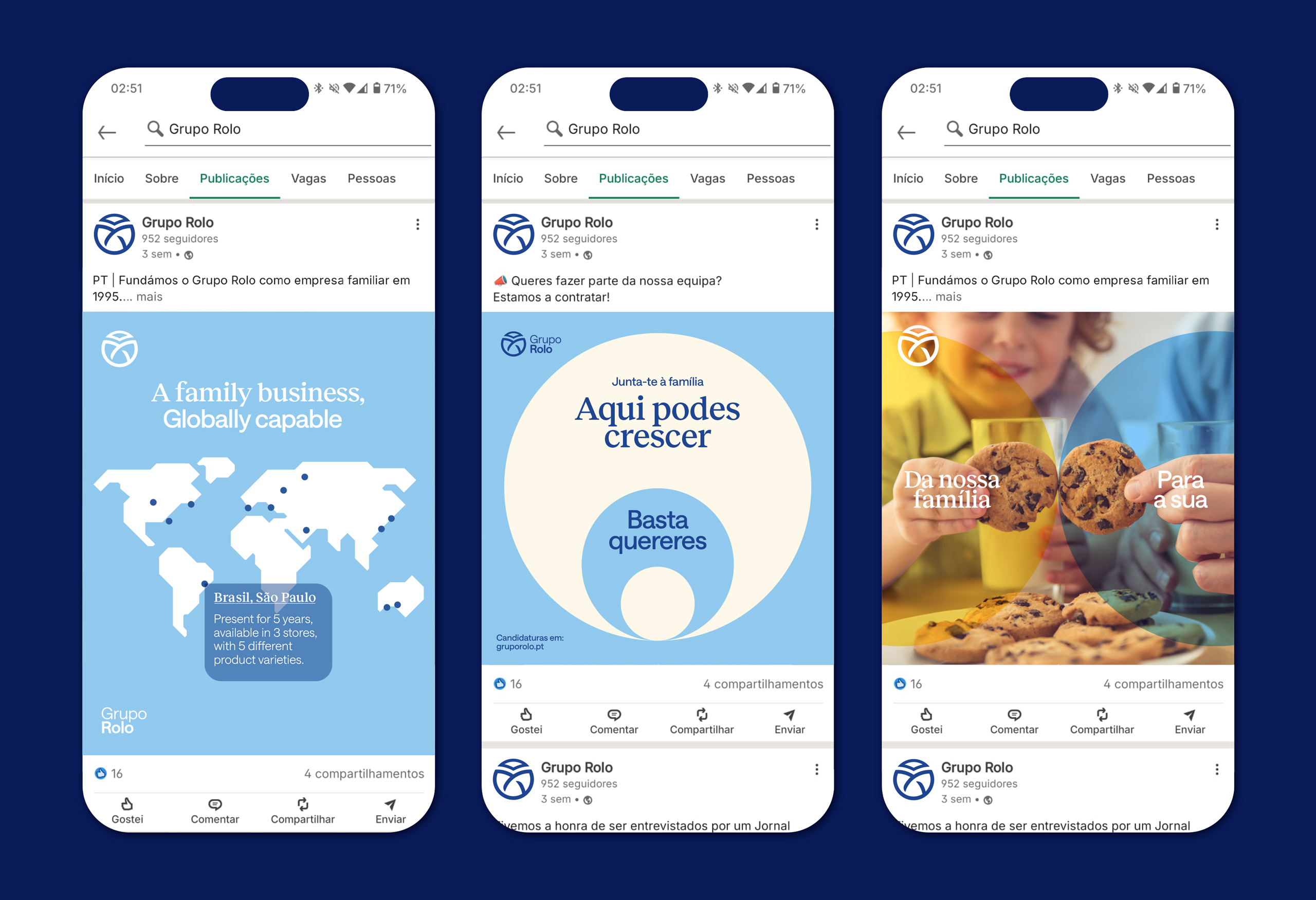
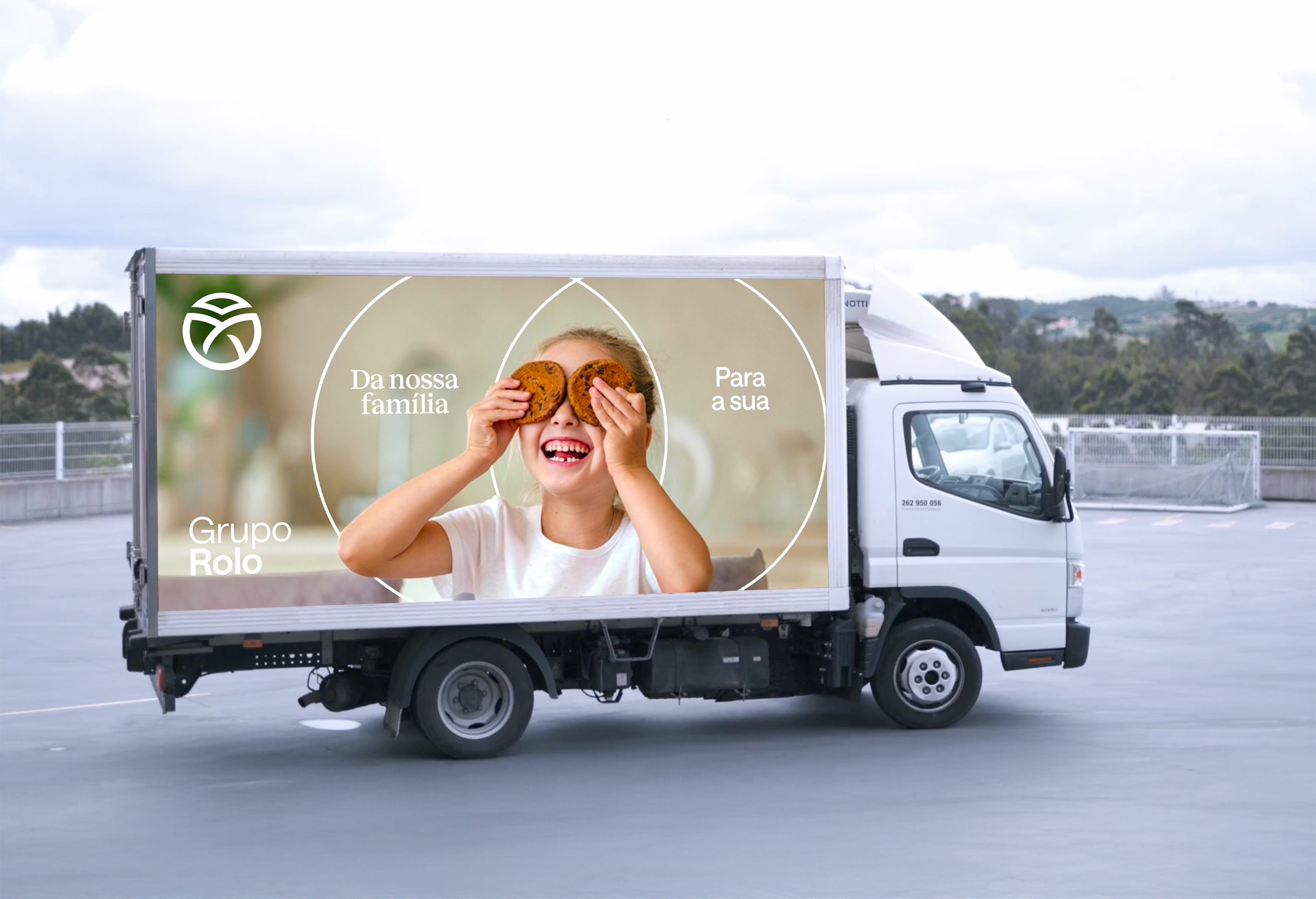
With these in mind, and following a collaborative workshop with the marketing team, we began shaping the communication strategy: moving forward, there would be two brands, each with its own challenges, positioning, personality, and target audience. Grupo Rolo — the institutional brand, focused on B2B and expressing the Group’s values. Rolo — the product brand, focused on B2C, products, and international markets. (See brand case here)
From there, we were ready for the fun part: The branding.
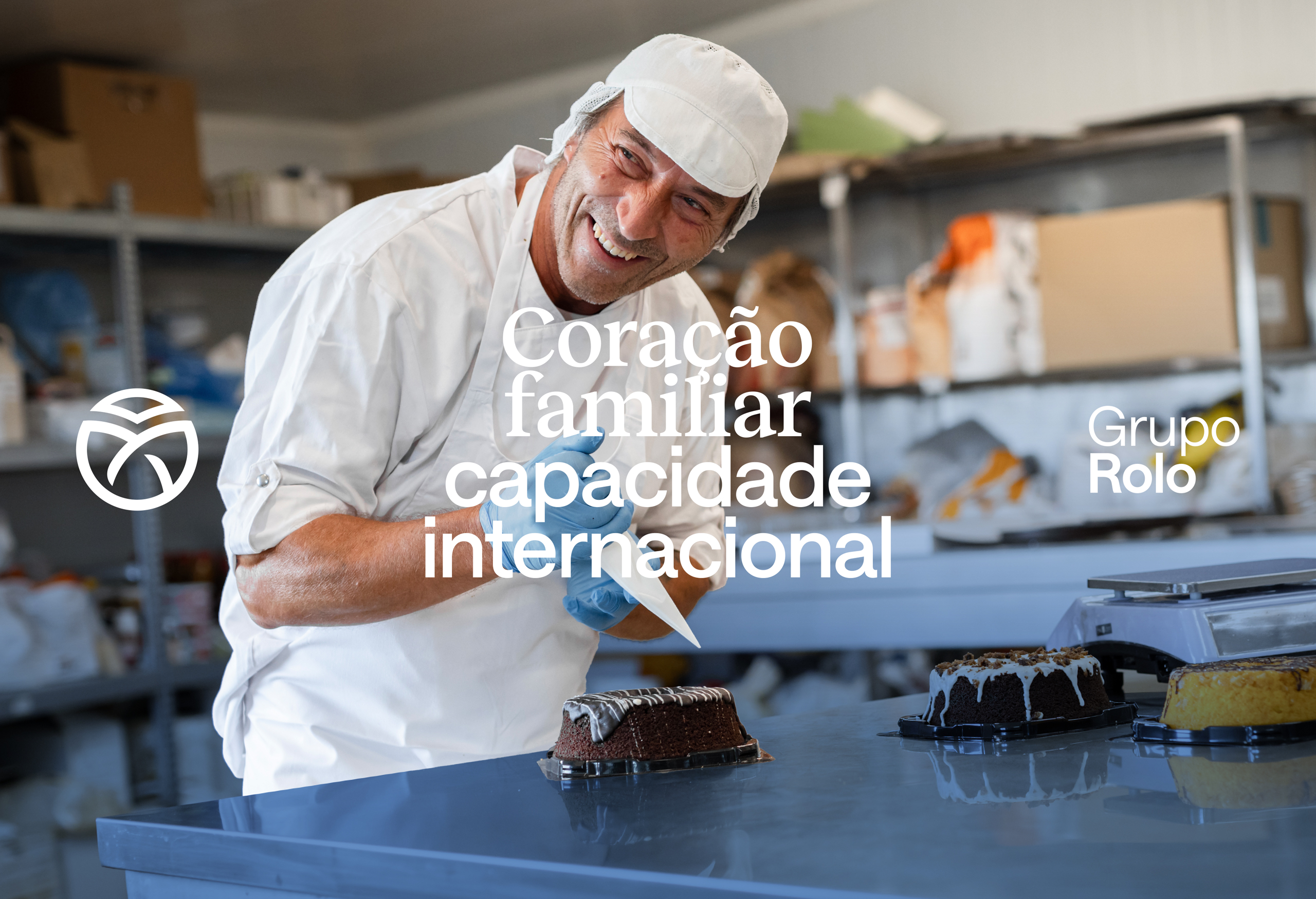
With the the main message being “Family Business, Globally capable” we set out to create a visual identity that could represent both sides.
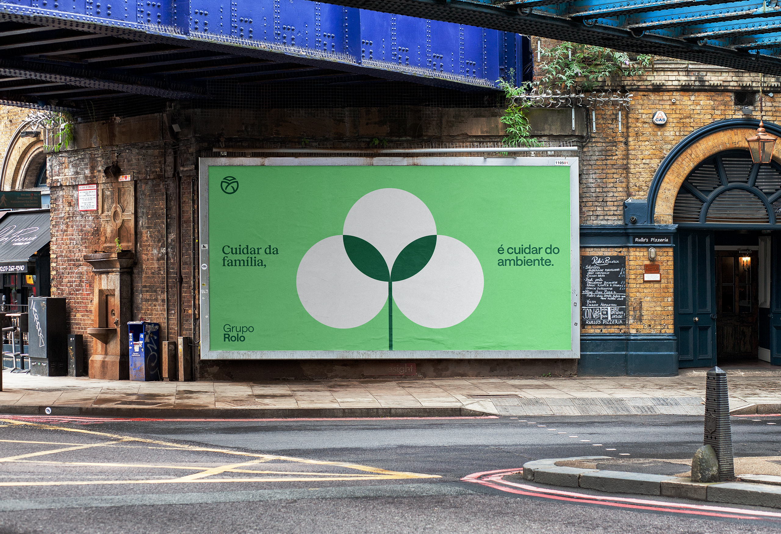
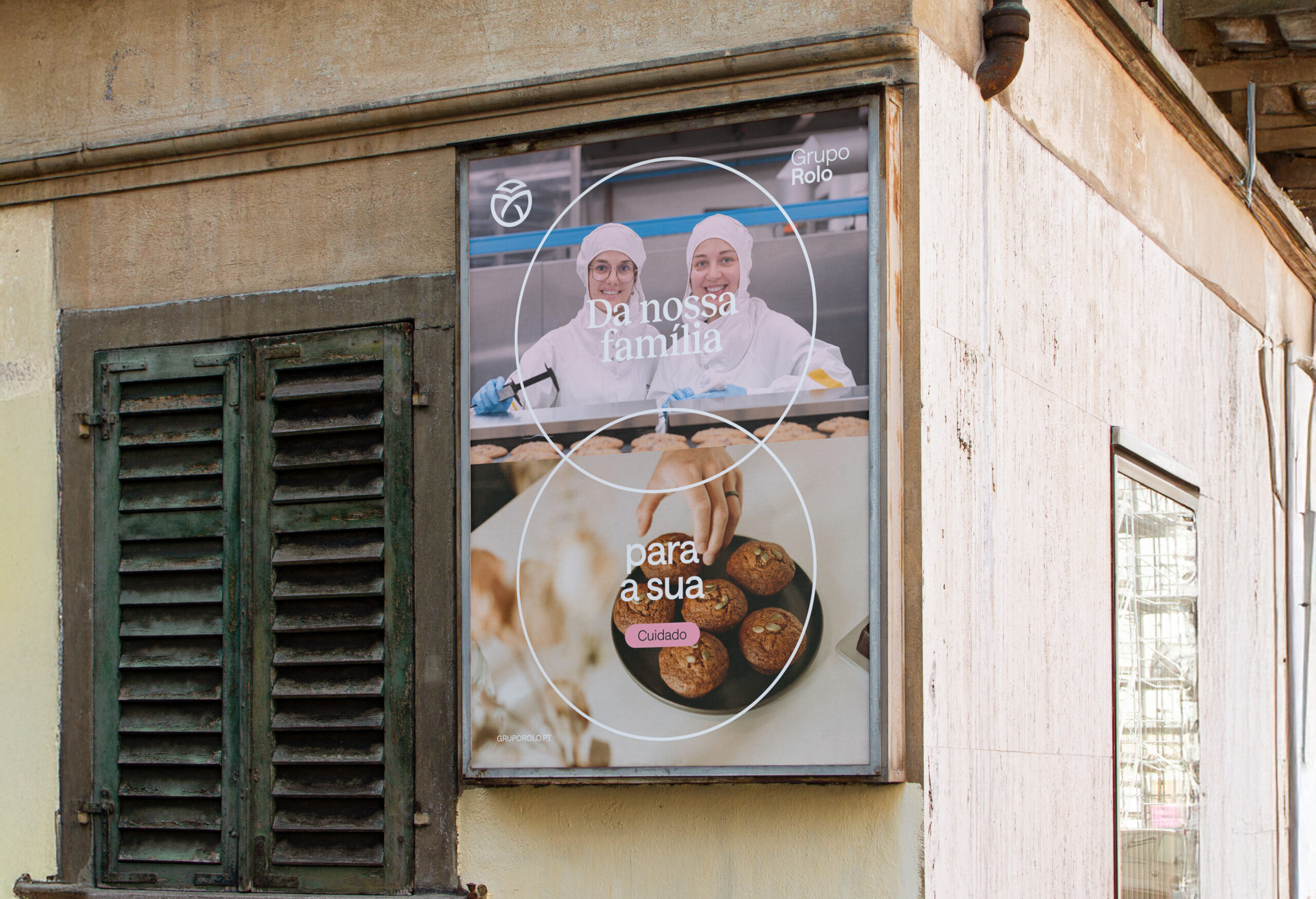
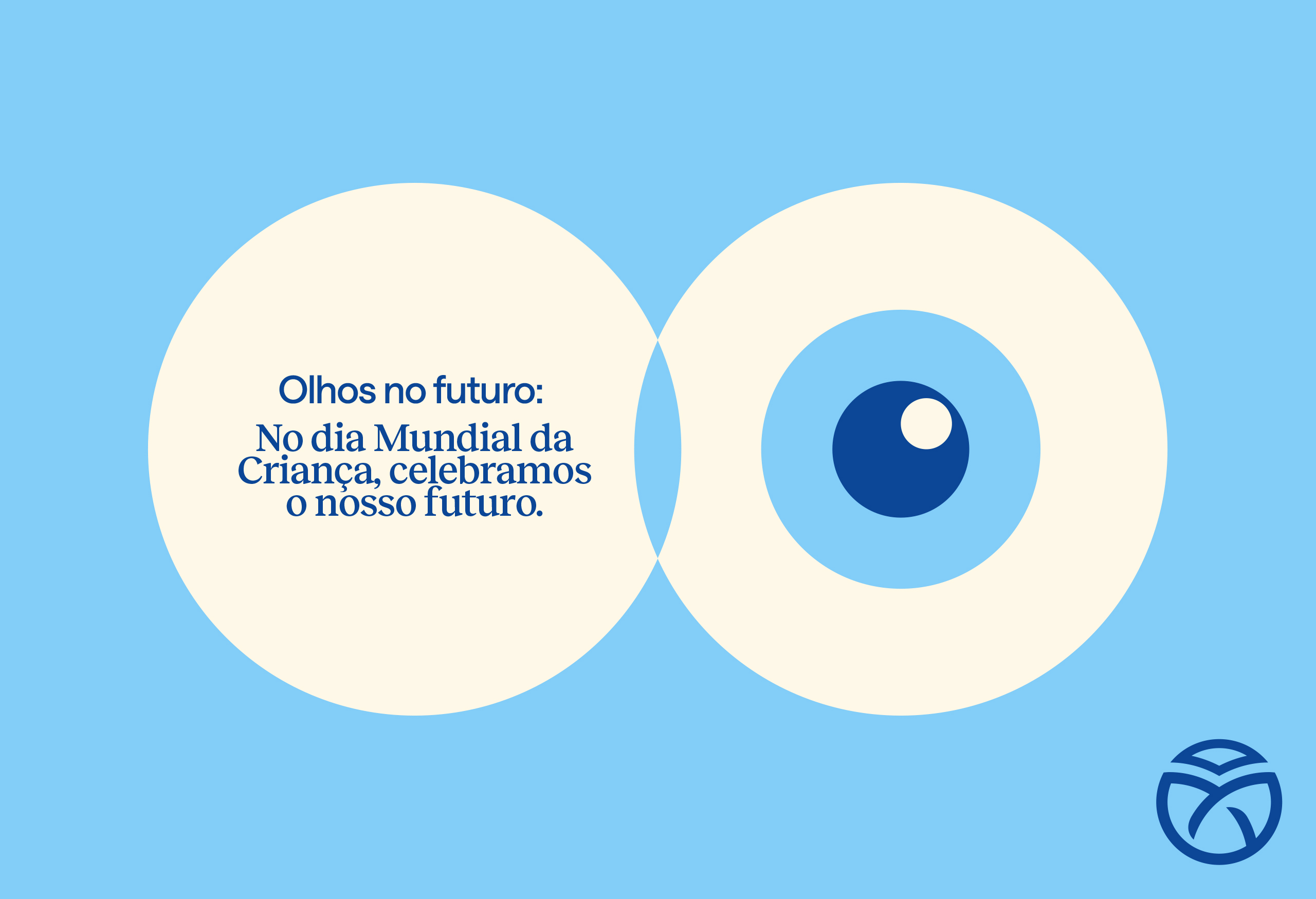
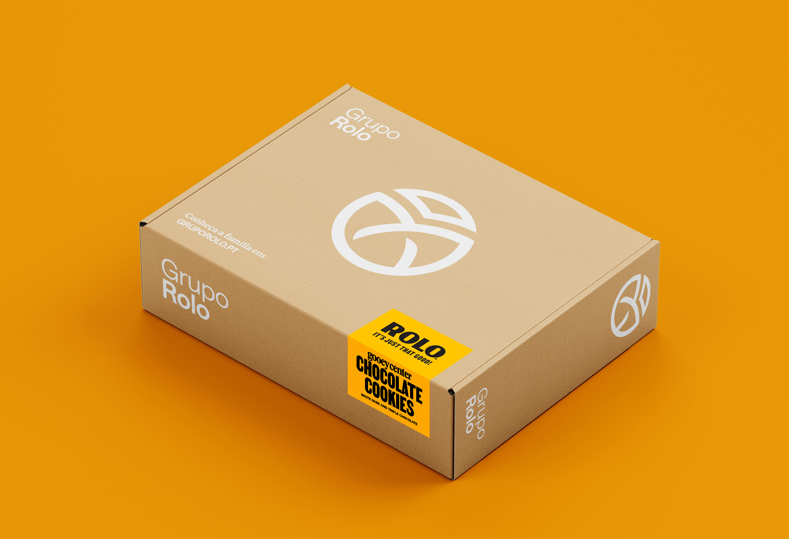
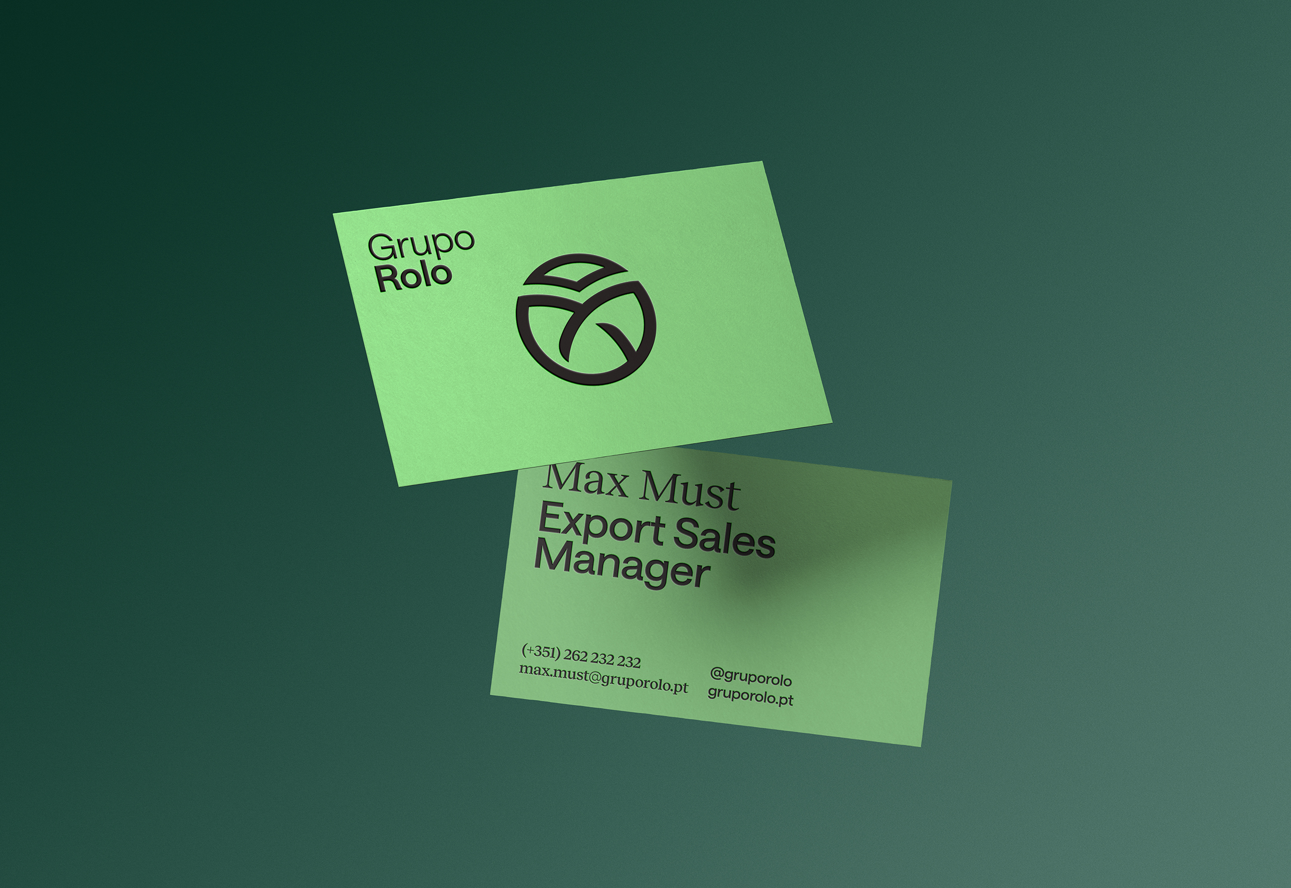
The logo is inspired by an ancient symbol representing family — the triquetra — formed by three equal elements united into a single, stronger shape. It also carries a vision for the future: the travelling swallow, symbolizing ambition to fly even further; the globe, expressing international reach; and the leaf, representing environmental responsibility.
Using the overlapping shapes of the triquetra as inspiration, we designed a brand system built from simple geometric forms that blend together to create something greater — like the members of a family.
The two sides of the brand — familiar and professional — appear on the typography system, with two complementing styles of serif and non-serif fonts.
The colour palette, divided into four main tones, represents four pillars of Grupo Rolo’s action: Yellow for Quality of their products, Blue for their International Capability, Green for the efforts in Sustainability, and Magenta for their familiar Care.
Finally, the photographic direction highlights the true reason for Grupo Rolo’s success — the family — by featuring the people who build this company every day.