Rolo
It's just that good
Rolo makes pastries. Delicious, creamy pastries.
So of course, their brand had to feel just as indulgent.
Categories
BrandingPackaging Design
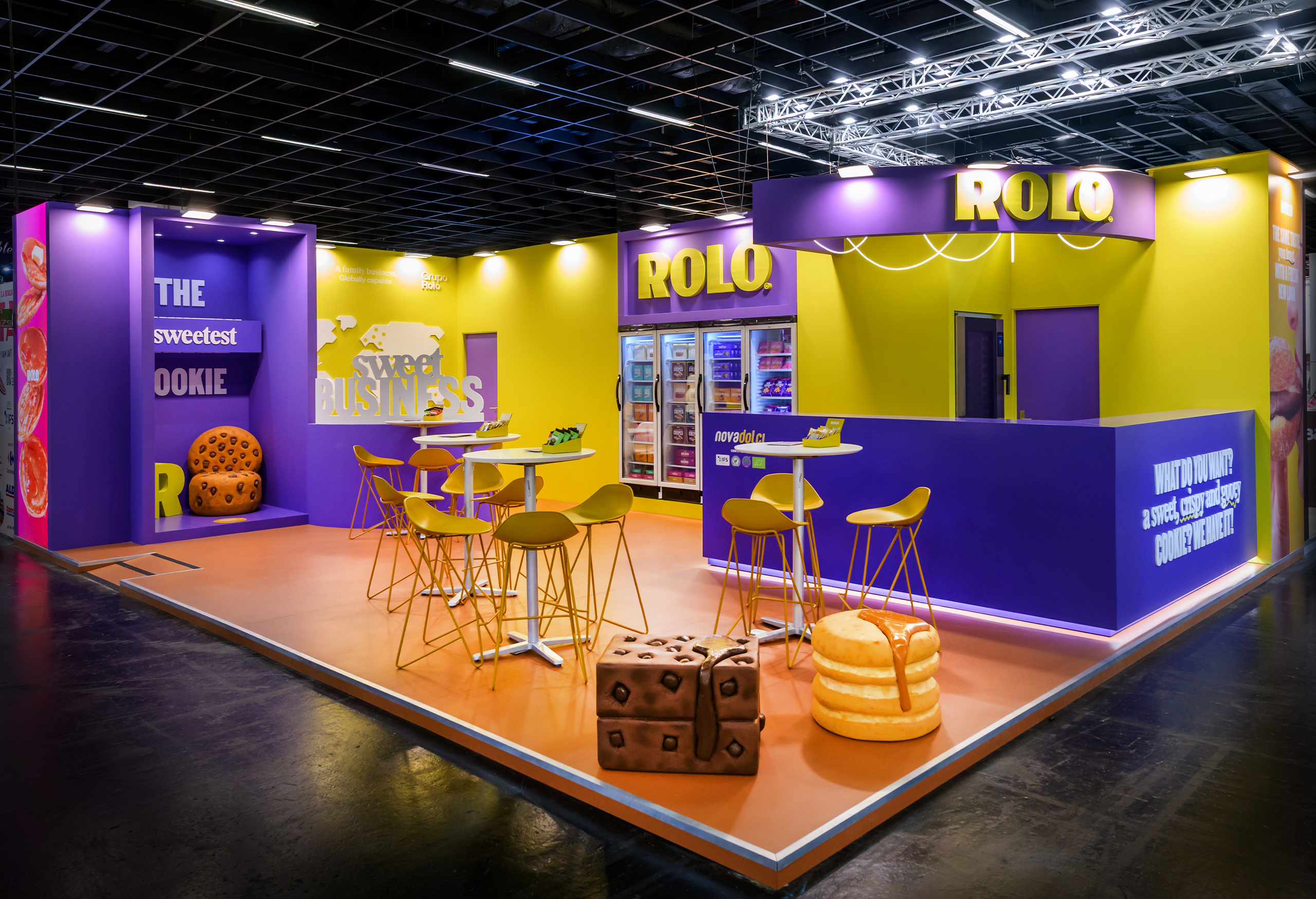
Environments
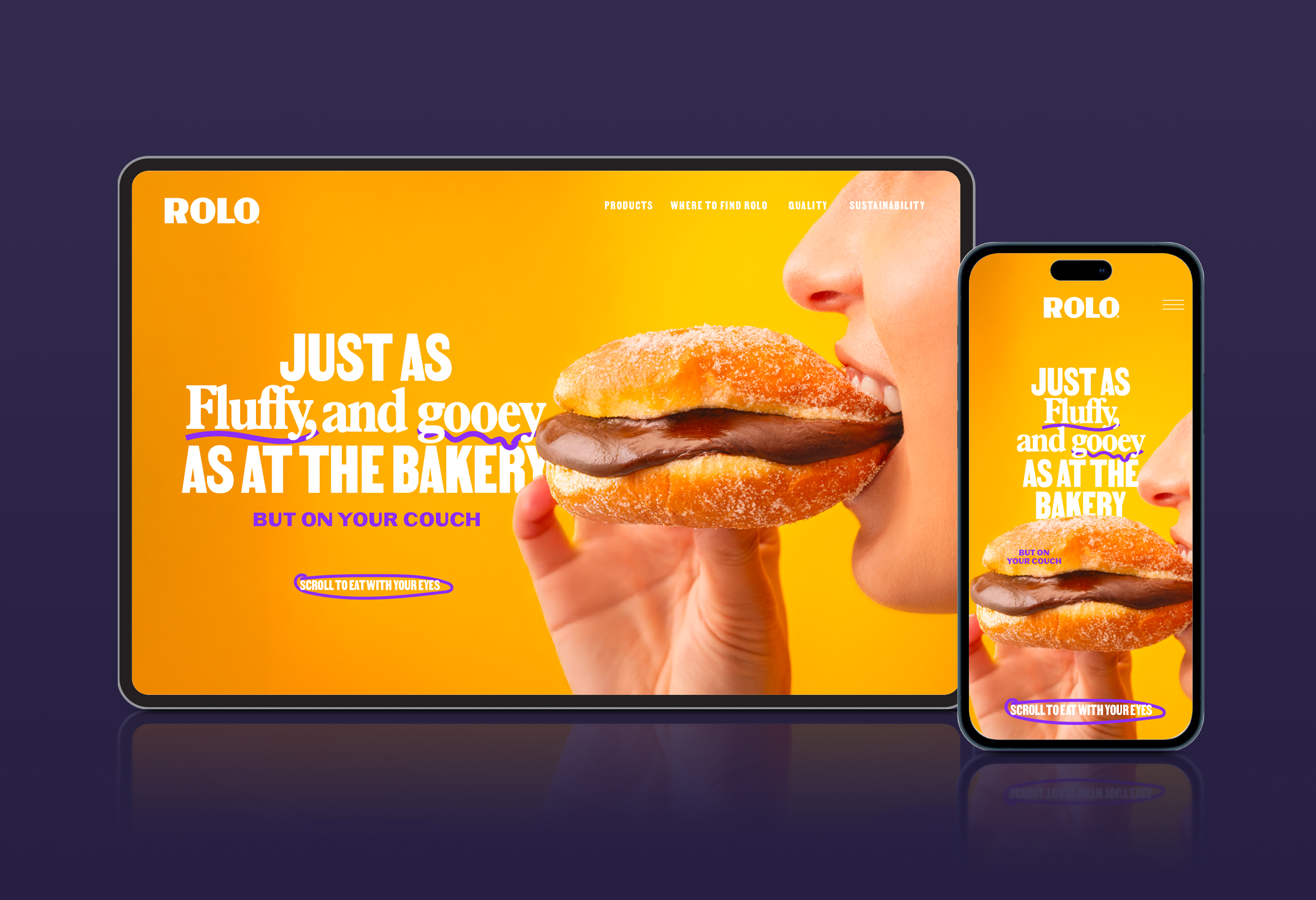
Web Design
Born as Grupo Rolo’s product brand (see case here), Rolo lives in the world of pleasure.
They believe quality and convenience can — and should — coexist. And they prove it every day, crafting pastries as good as the ones from your favourite bakery, yet made for you to savour at home.
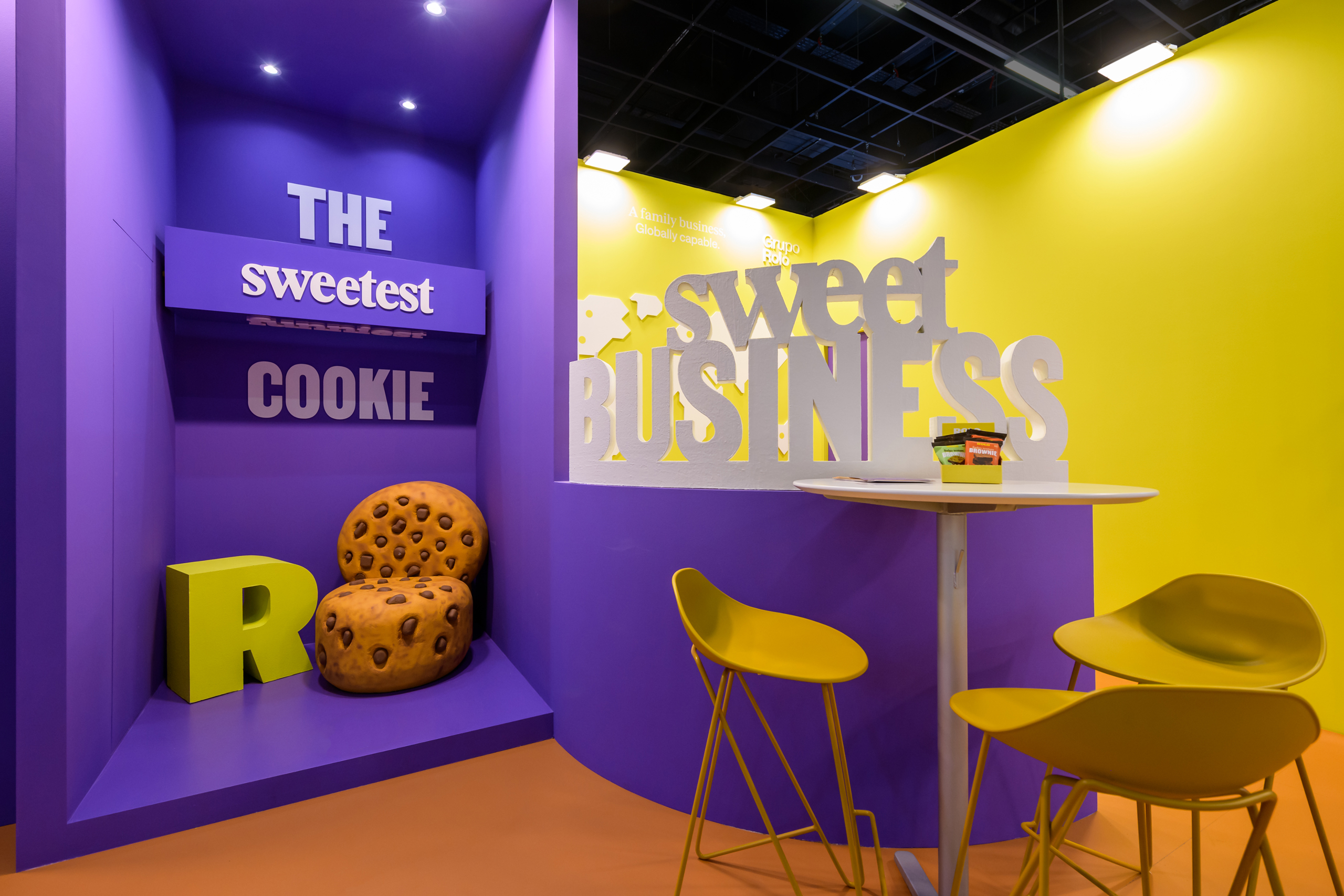
From the very beginning, we knew this brand needed to be Fun, Impactful and, above all, Indulgent.
Not just a brand that talks about indulgence, but one that breathes it — in its tone, its visuals, its presence.
Every touchpoint needed to awaken the senses.
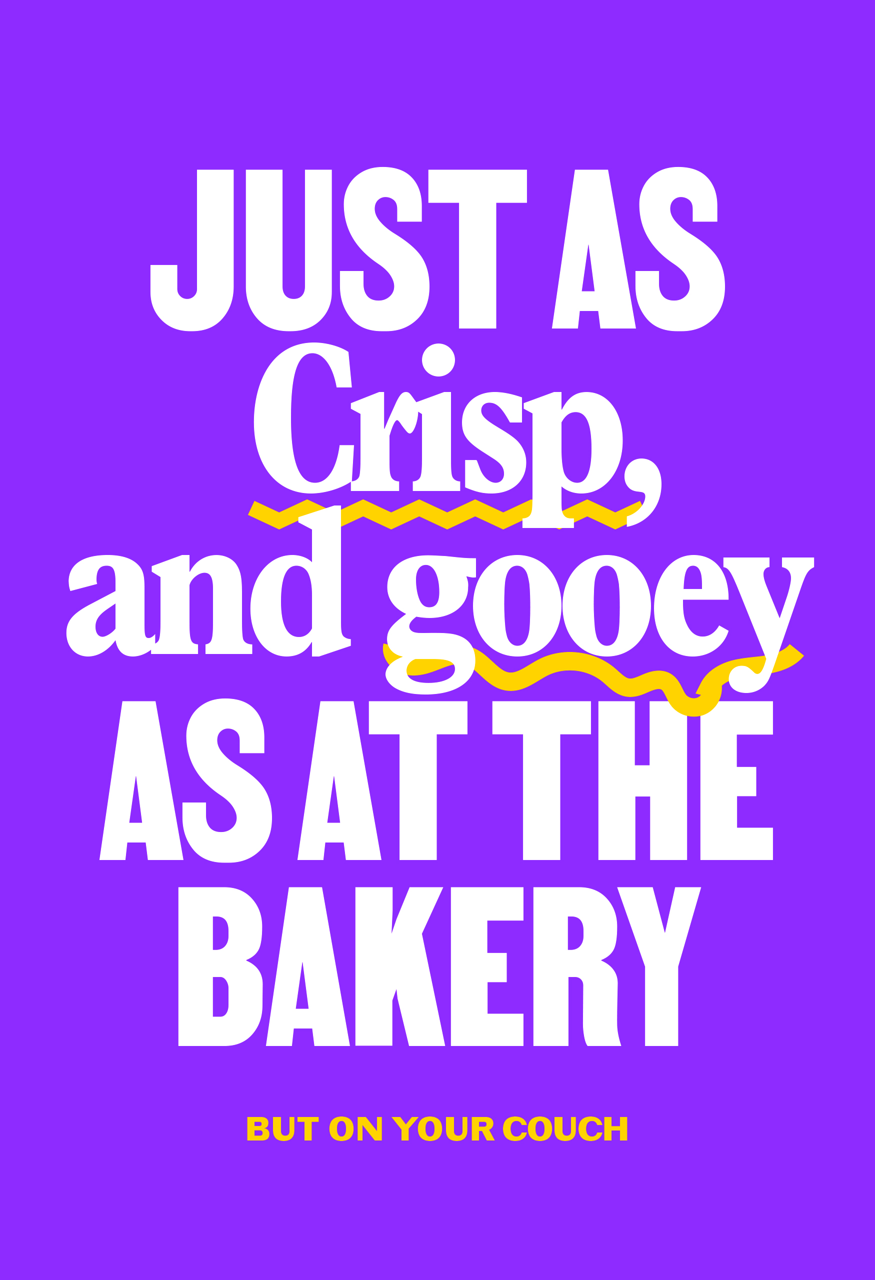
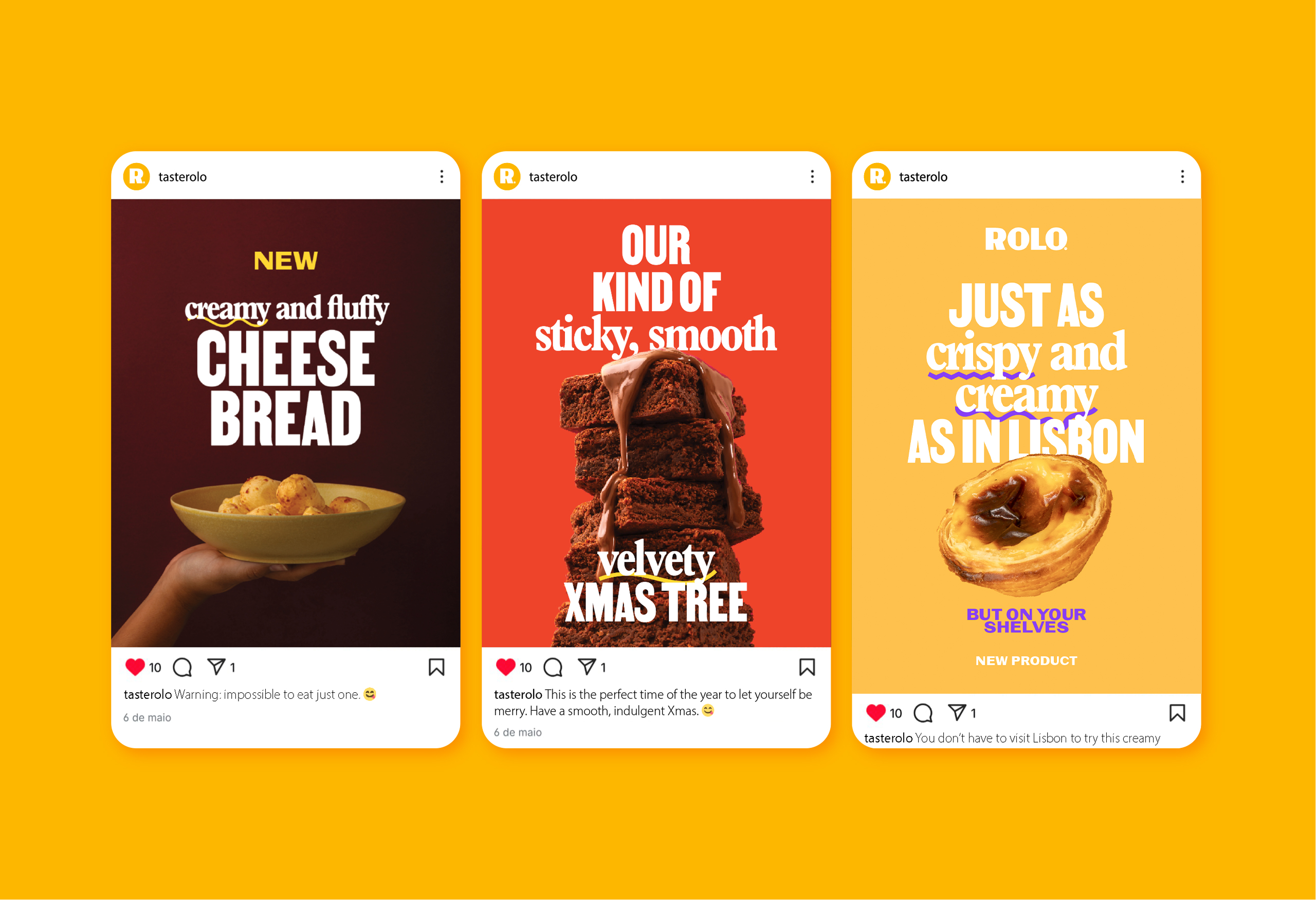
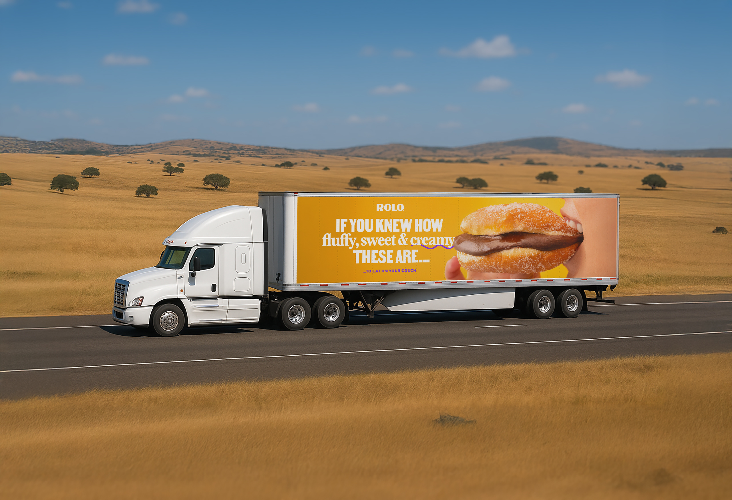
Whenever Rolo spoke, it spoke of texture before anything else: the smooth, velvety chocolate comes first; whether it’s dark, milk, Swiss or Belgian is almost a footnote.
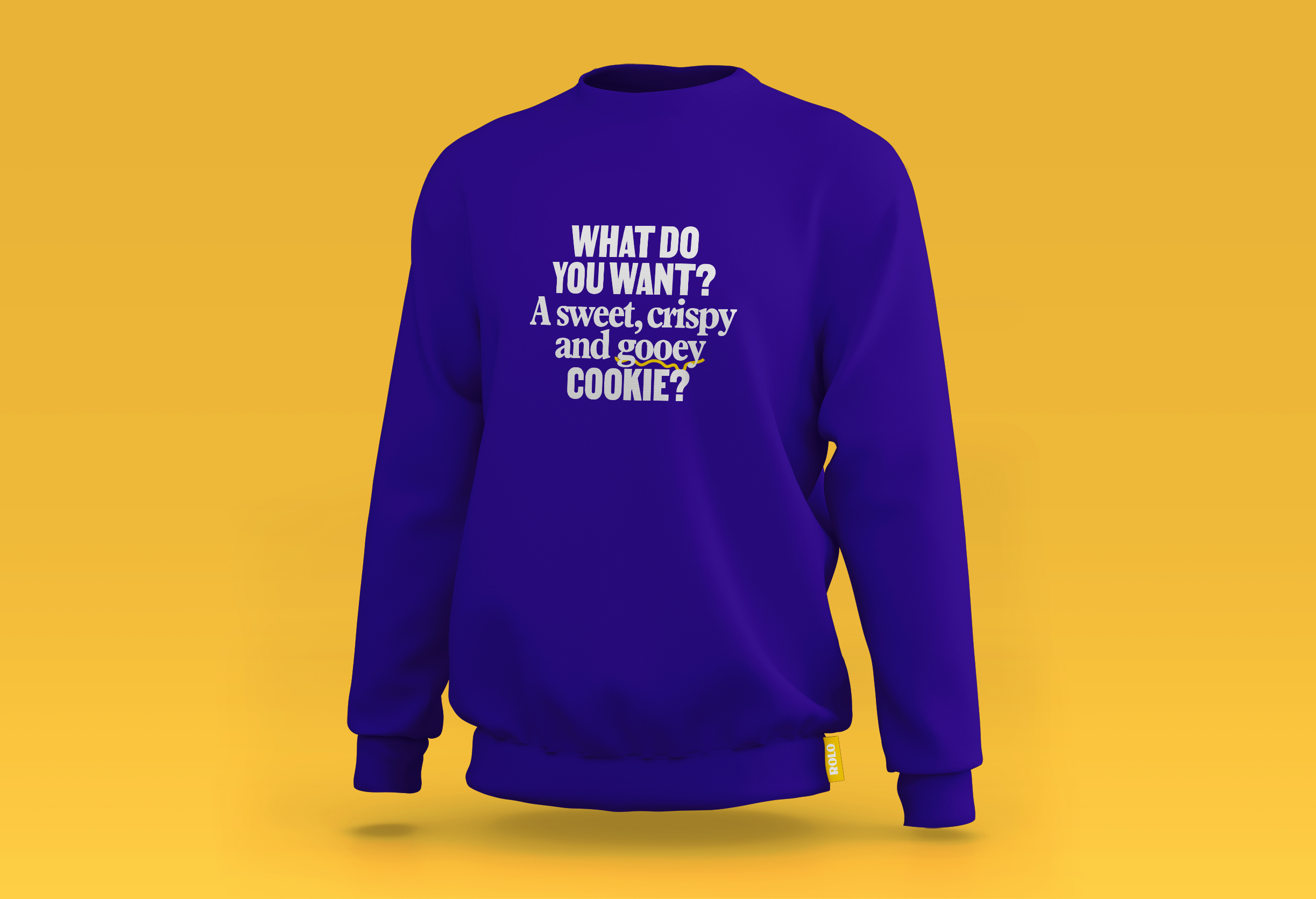
This sensory world is supported by the typography system: one style that grabs attention, and another that evokes touch and taste — strengthening the haptic experience.
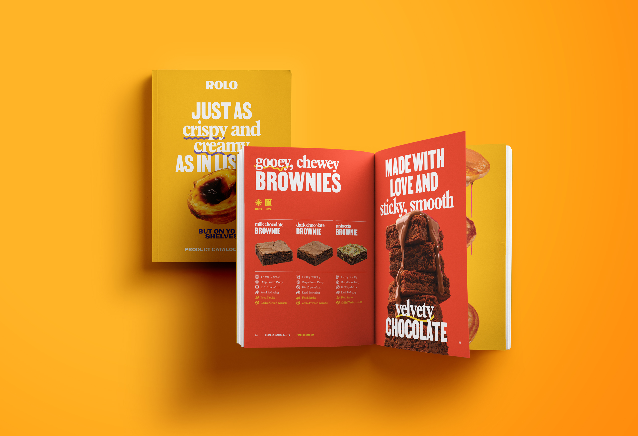
We created a set of underlines inspired by sensations themselves: smooth, crispy, gooey — each one a small gesture toward indulgence.
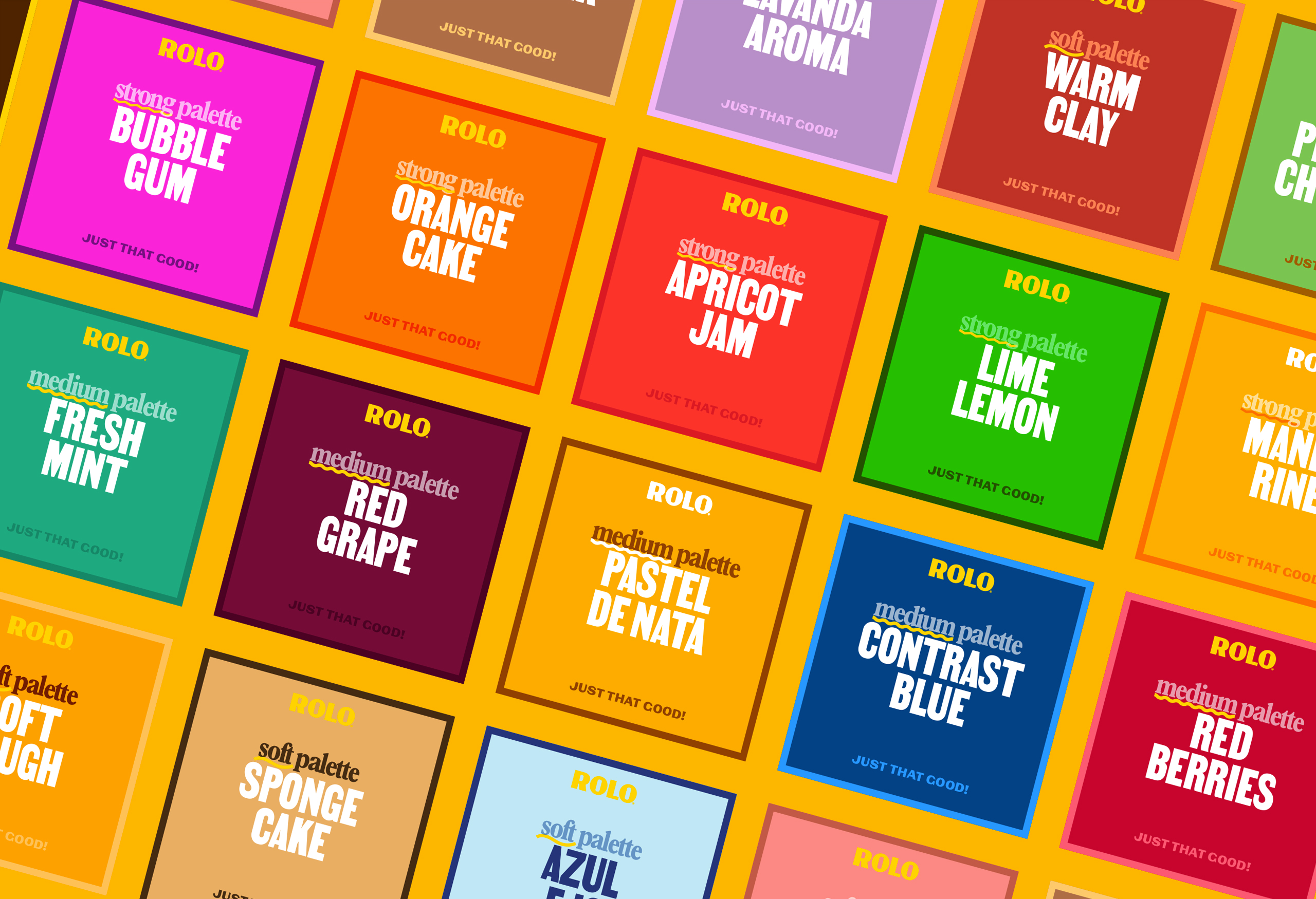
The colour palette is bold and dynamic, blending into endless combinations.
The photomood brings the story full circle, capturing moments of pure enjoyment and inviting the viewer to feel the texture, the warmth, the pleasure.
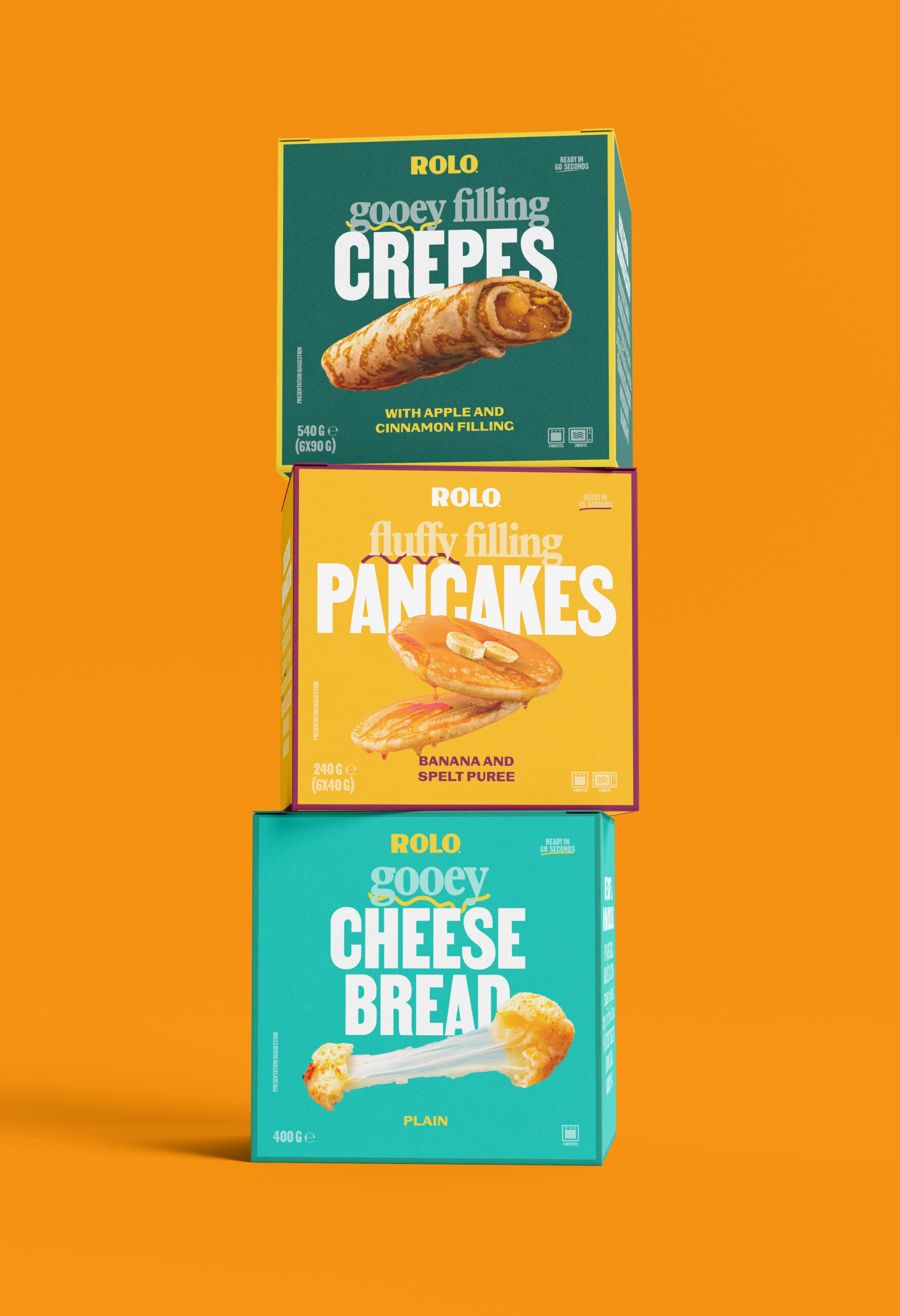
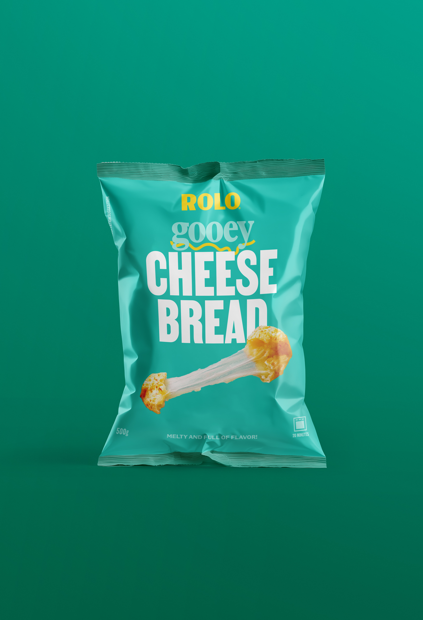
For the packaging, we built a flexible system, ready to adapt to any product, size or medium.
No matter the format, the product remains centre stage, with its most sensorial qualities highlighted to spark desire.
This adaptable system let us bring indulgence everywhere the brand lives — from social media to exhibitions, catalogues to merch.
Rolo’s brand is, like their pastries, a happy pleasure.