Trinca Bolotas
Refreshing a classic
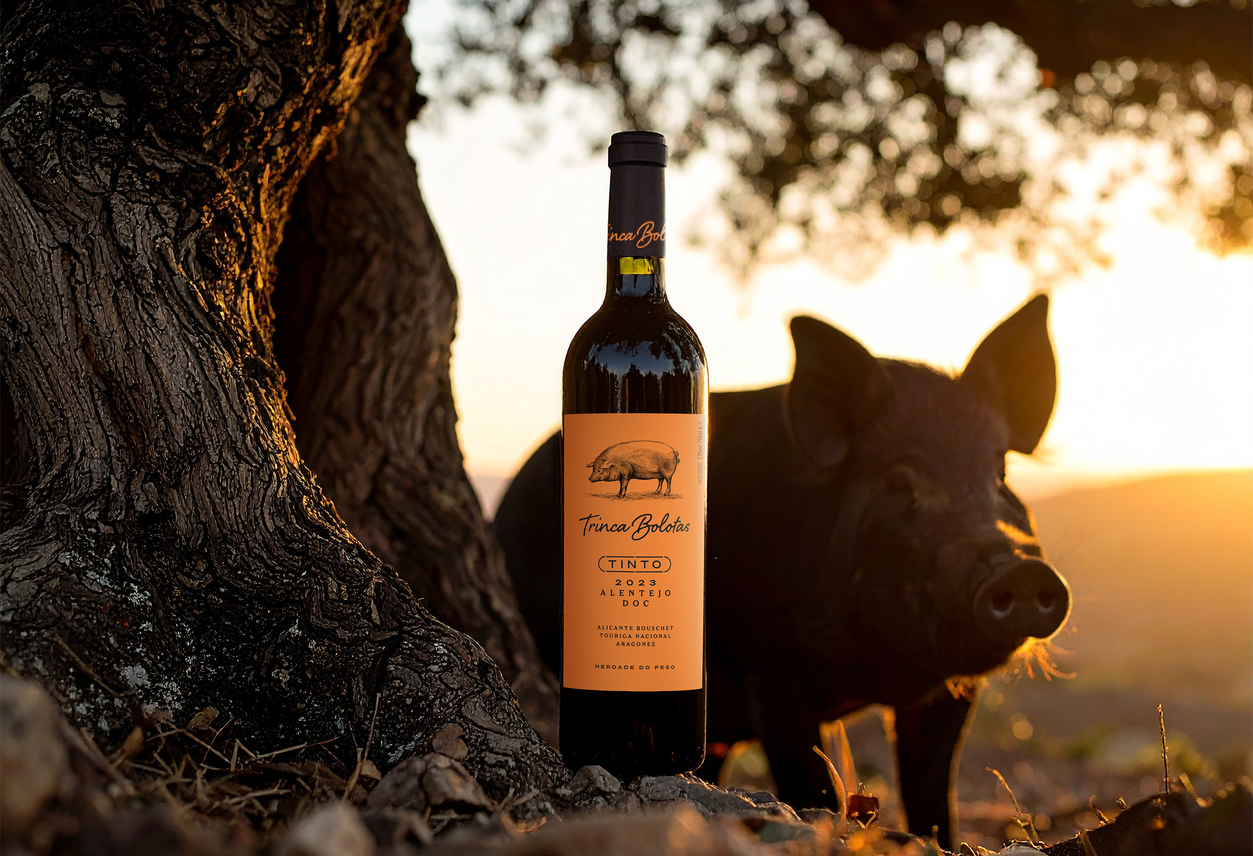
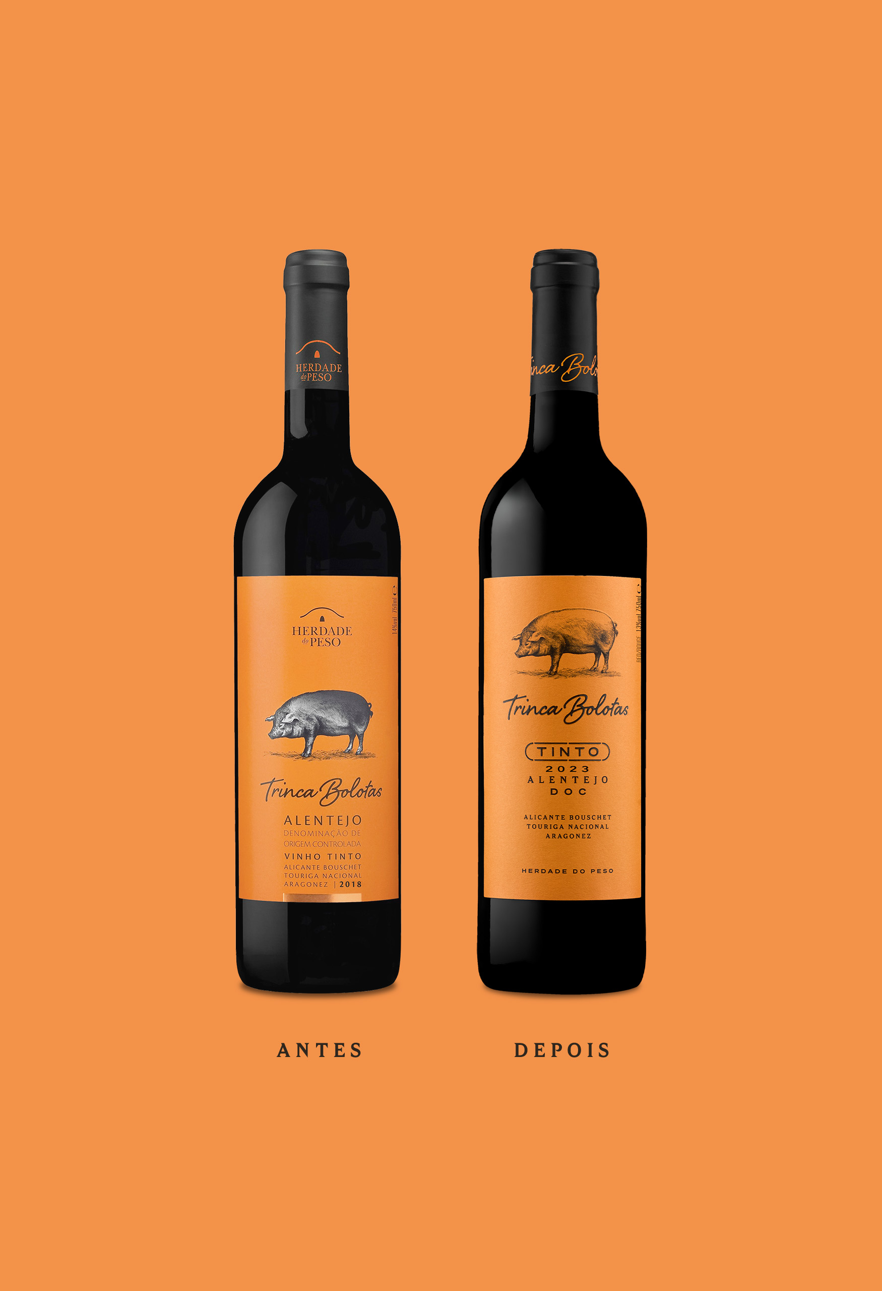
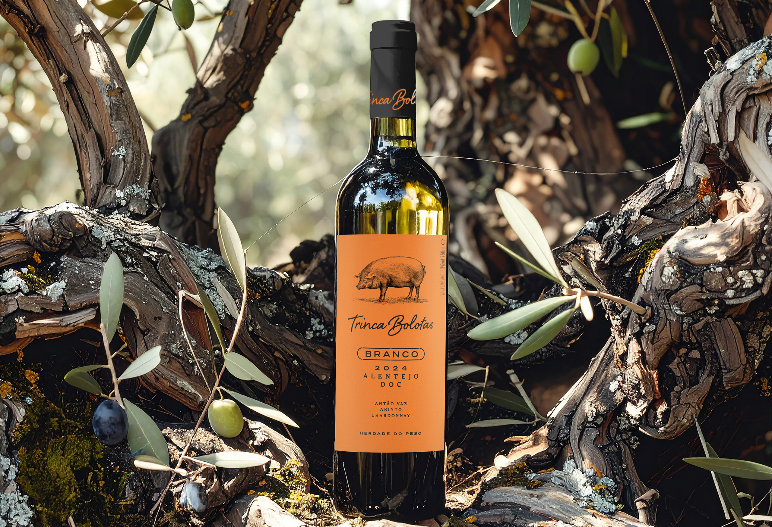
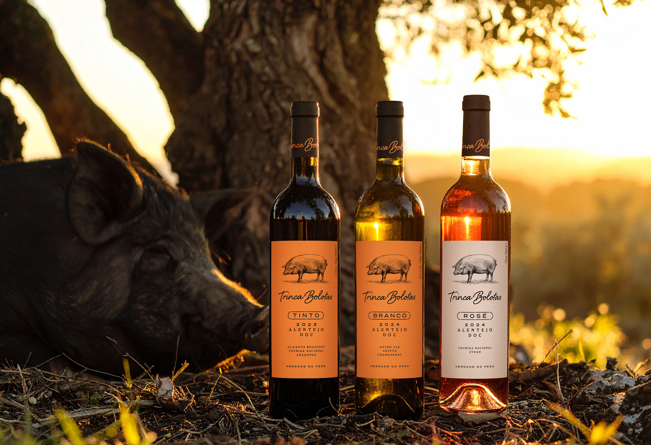
Trinca Bolotas has long been a fixture on Portuguese shelves, instantly recognisable for its bright orange label and iconic Alentejo pig illustration. For this refresh, the goal was clear: honor the brand’s heritage while elevating it for today’s market.
Categories
BrandingLabel Design
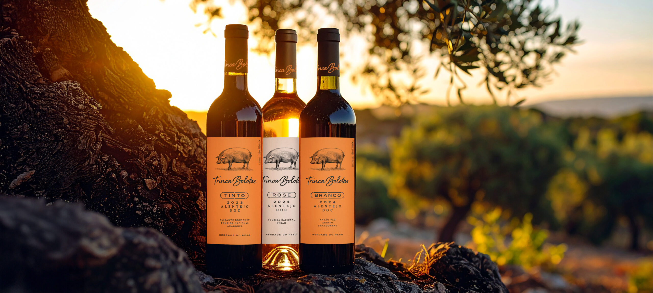
The Alentejo pig illustration was retained but refined—its dated gradient background removed—and given pride of place as the label’s hero element. This shift allows the Trinca Bolotas brand to take center stage, with the producer, Herdade do Peso, stepping back into a supporting role.
The typography system, inherited from earlier Herdade do Peso designs, was completely reorganized to improve hierarchy and readability. This restructuring makes product information more accessible while lending the label a cleaner, more contemporary aesthetic.
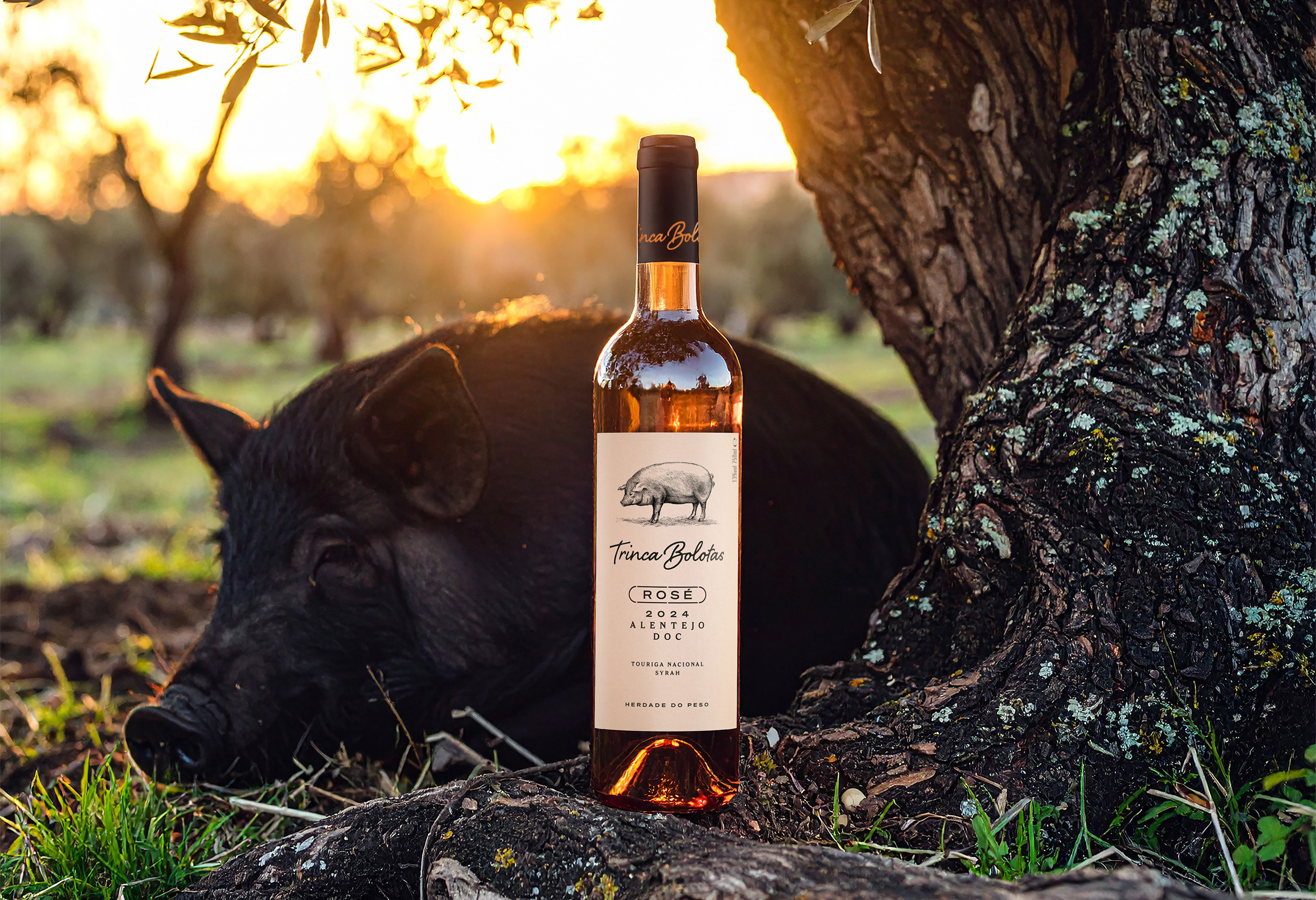
For the Rosé, a wine often associated with freshness, the design adopts a soft pastel palette that complements both the transparent bottle and the wine’s natural hue.
The result is a label that feels modern yet timeless—more elegant and balanced, with a stronger emphasis on Trinca Bolotas’ unique identity, all while remaining instantly recognisable to loyal customers.