Trinca Bolotas Reserva
Elevating a classic
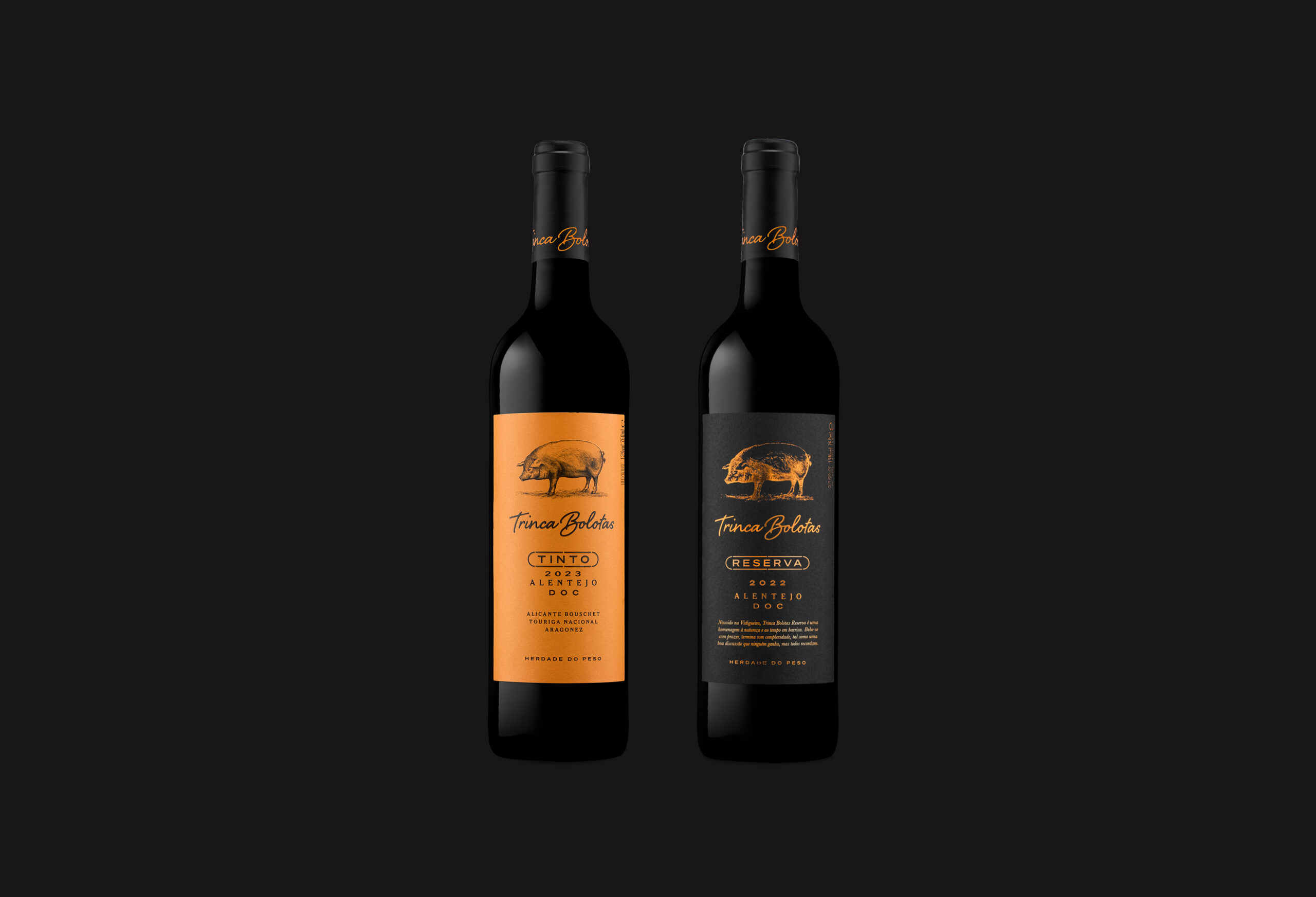
Following the successful refresh of the classic Trinca Bolotas label, we faced a new challenge: how to introduce a Reserva that feels instantly recognisable as part of the same family — yet signals a clear step up in value and sophistication.
Categories
Packaging DesignLabel Design
Our approach: as different as night and day, without changing a thing.
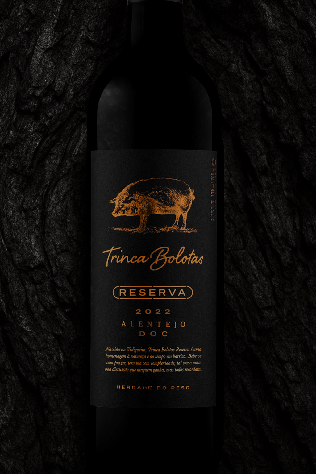
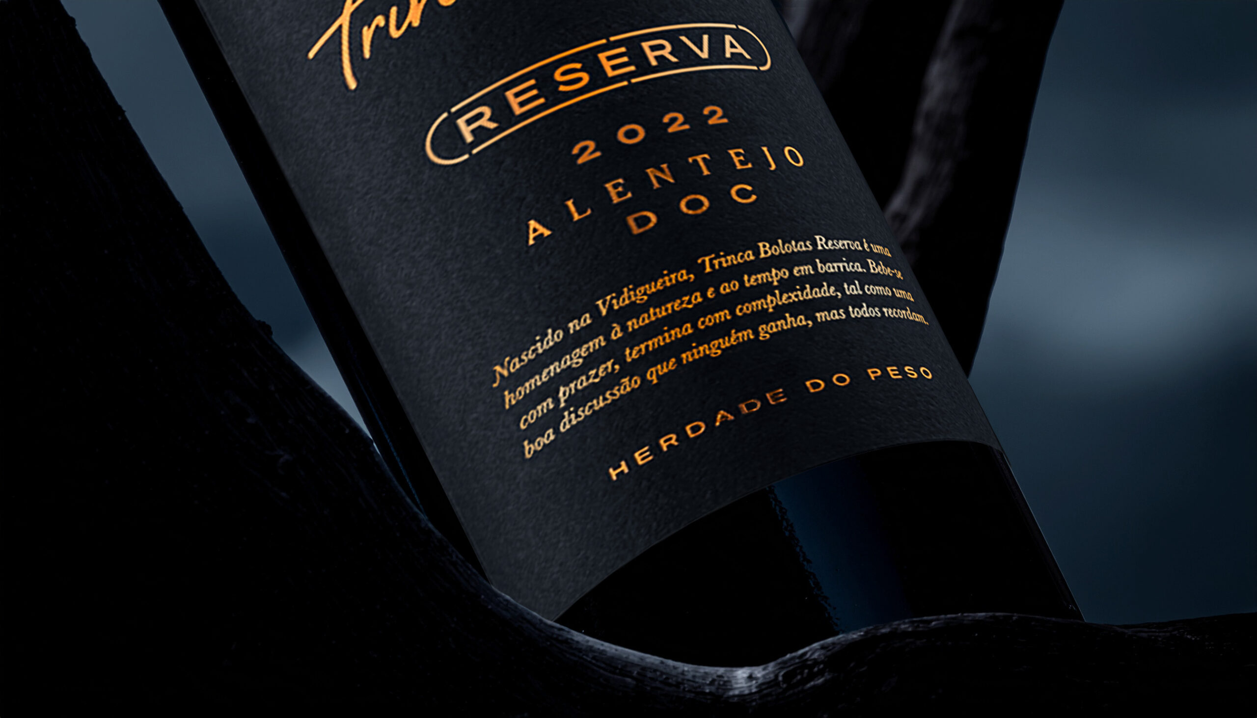
Maintaining the original layout was essential to preserve brand equity and recognition. The signature bright orange — one of the brand’s most distinctive assets, second only to its iconic pig — retained its presence, now elevated through a refined metallic foil finish over deep black, martelé-textured paper.
By inverting the colour scheme, we embraced the visual language of premium wines while turning the orange foil into a bridge between past and present: a reminder of the brand’s roots and a statement of its new status.