Awa
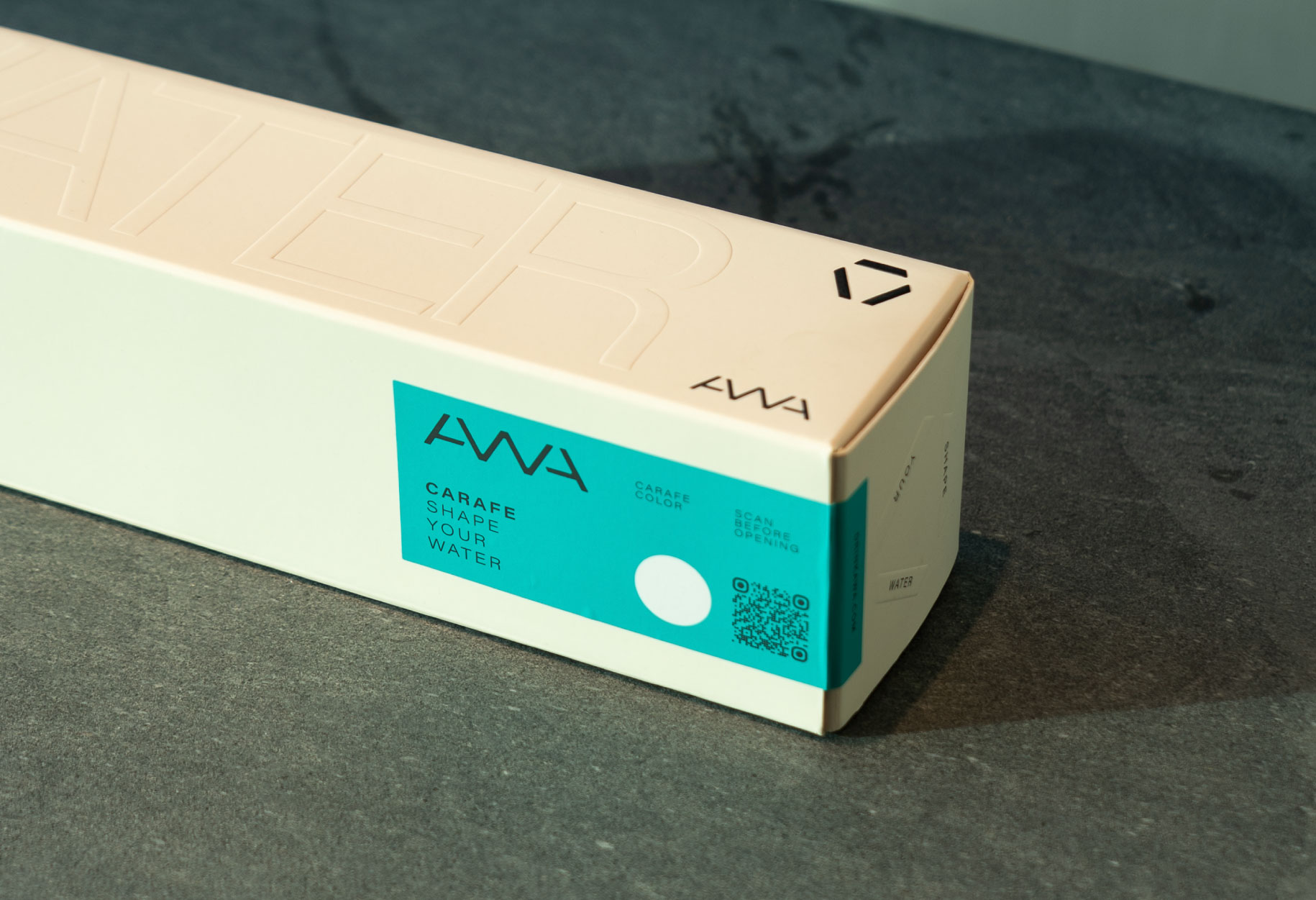
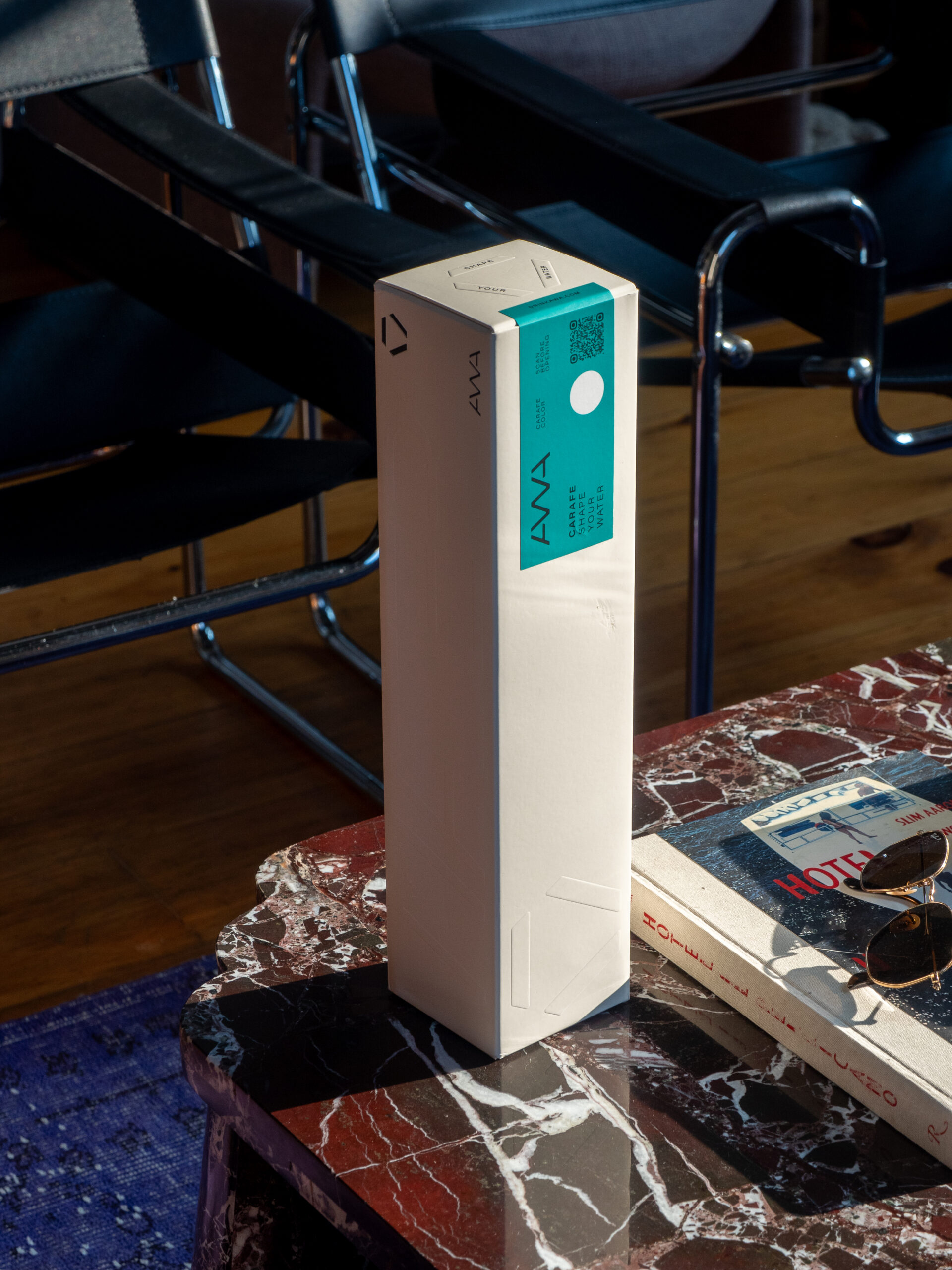
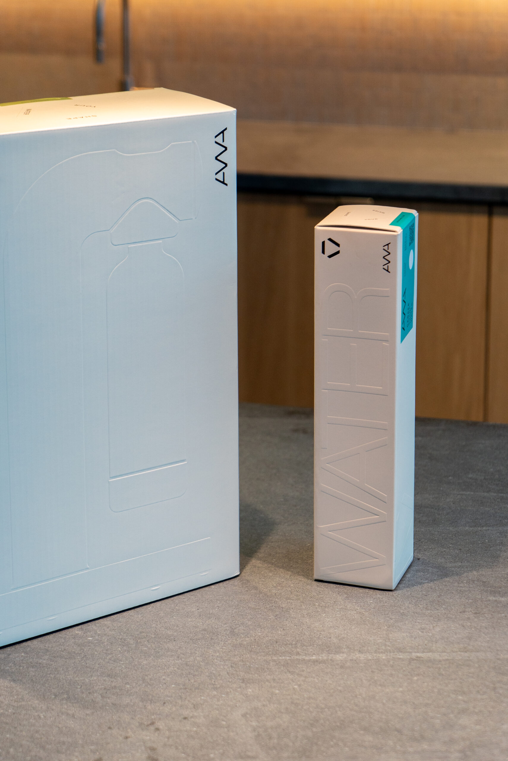
Shape Your Water
AWA is a sparkling water brand built around a simple but powerful idea:
water can be shaped to fit different needs, moments and preferences — without waste, without excess.
Categories
BrandingPackaging Design
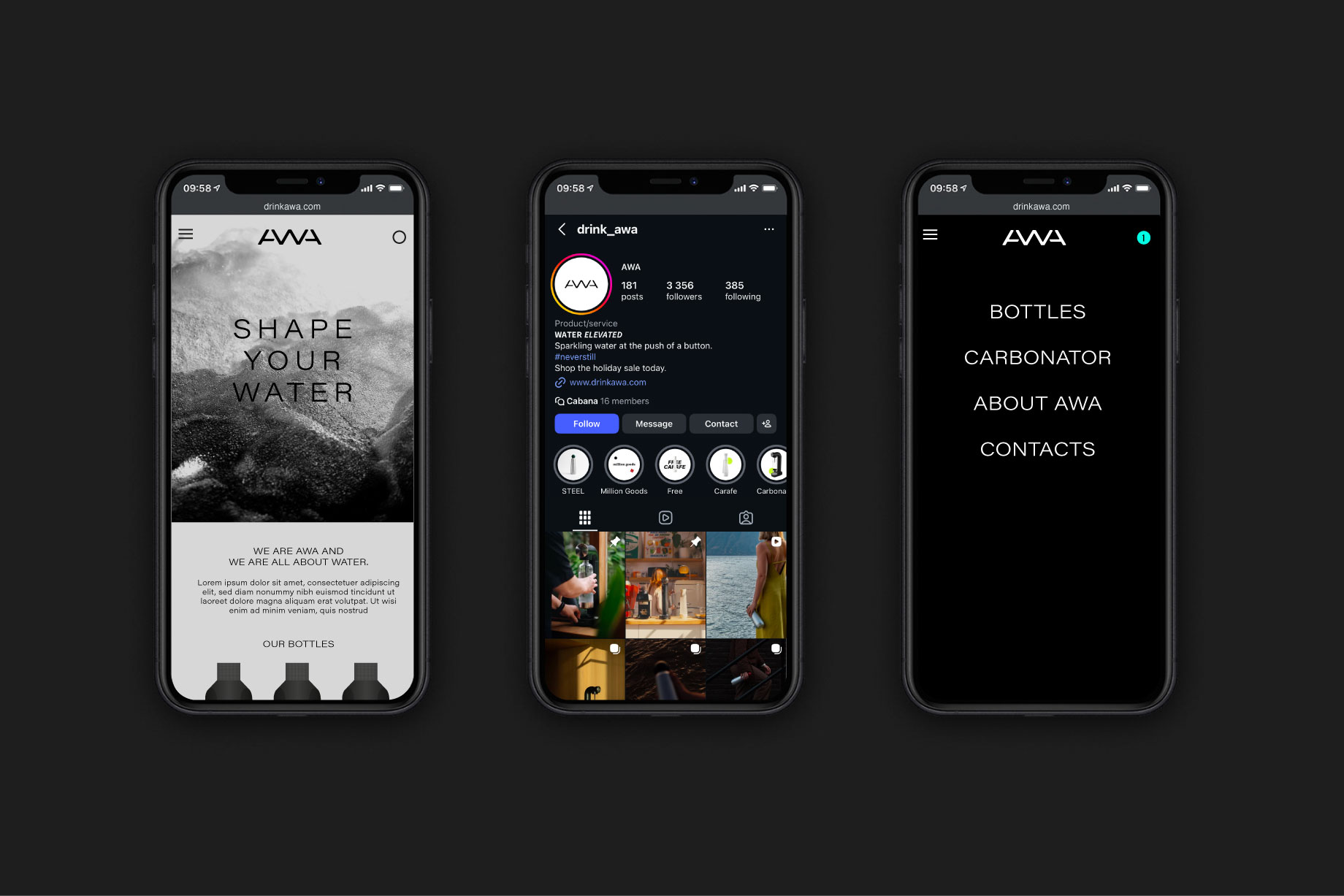
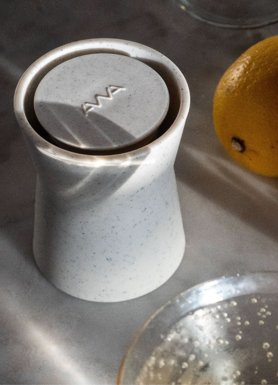
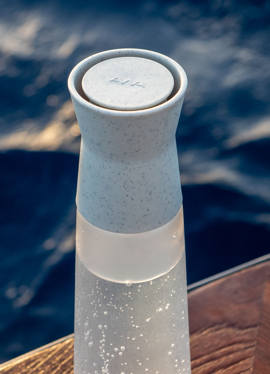
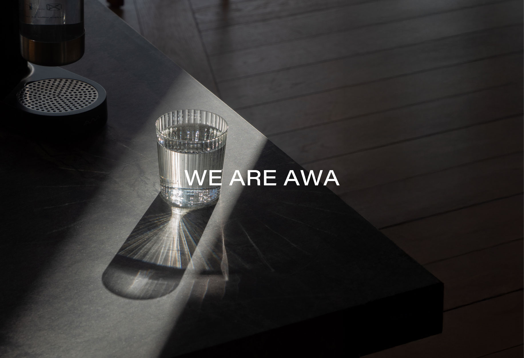
In a category where packaged water is often transported and consumed in single-use formats, AWA sought a distinctive presence, one that clearly reflects its product experience, design intent and everyday ritual.
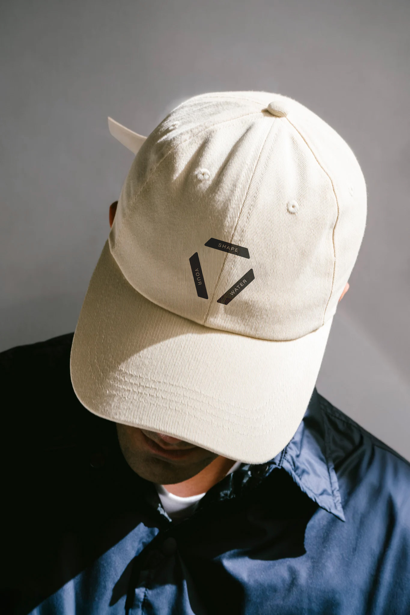
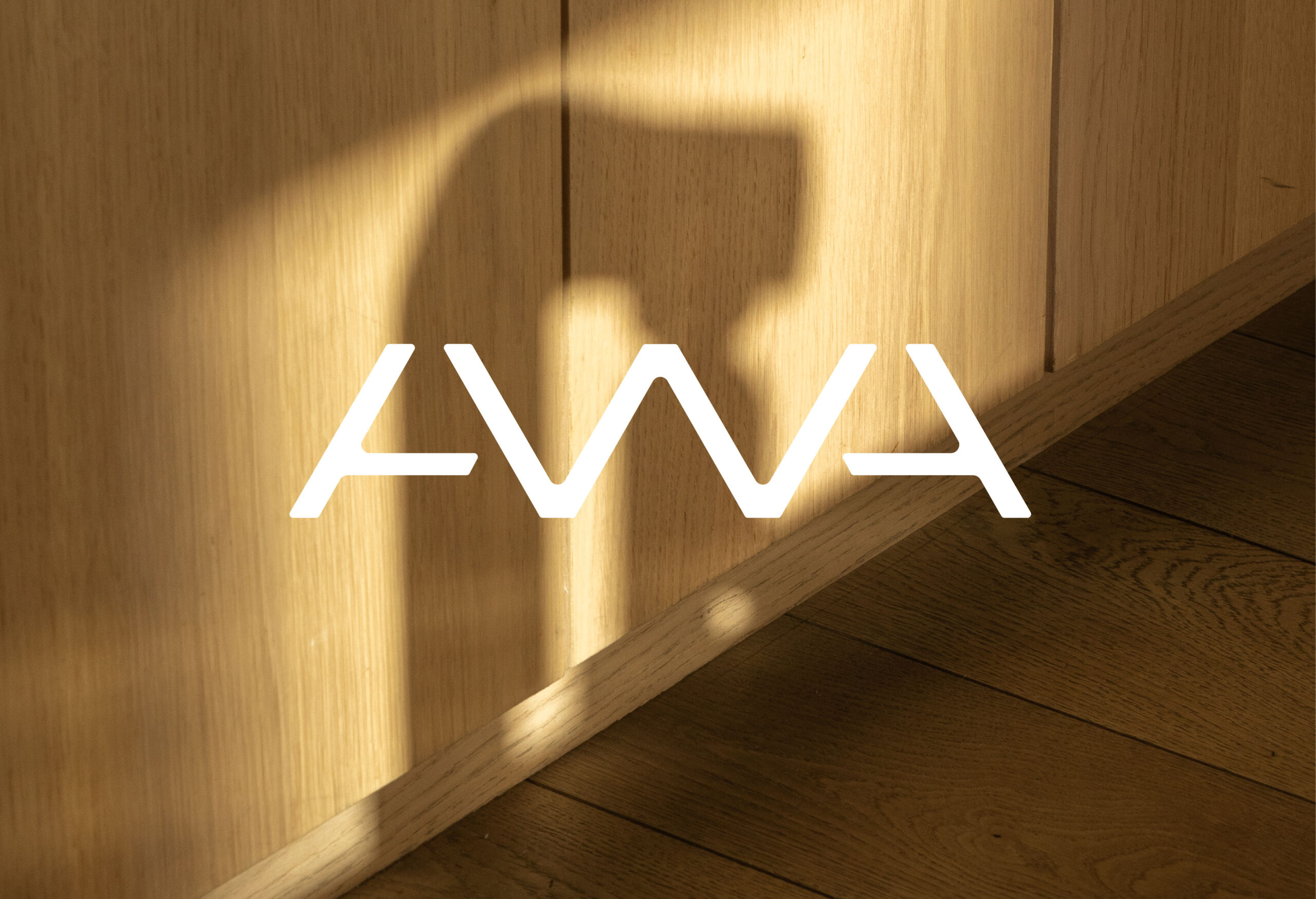
The project began with an idea rooted in form and meaning. Water, in its essence, exists in multiple states and adapts to context. Inspired by this, the team at Volta grounded the brand concept in a simple, geometric foundation, the triangle, the alchemy symbol for water. This principle became the basis for a visual language that balances clarity, flexibility and relevance across touchpoints.
The identity system brings this logic to life through meticulous geometry, structural coherence and a refined typographic and colour strategy. The logo uses the equilateral triangle as its core module, informing not just the mark itself but a wider graphic system used across packaging and digital applications. The design embraces minimalism and functionality, with visual cues that communicate freshness and a modern lifestyle.
The result is a distinct, coherent and expressive brand that elevates a familiar product category. AWA’s identity system not only stands out visually in a crowded market but also reinforces its core proposition: elevating how sparkling water is made, enjoyed and shared, anywhere and anytime.